

Website Visual Design & Branding
This guide forms part of our complete Small Business Website Design & Redesign resource, where we break down every major component of building a high-quality website.
Visual design is what people notice first, but it’s not just about making a website look good.
It shapes how your business is perceived within seconds. Before anyone reads a word, they’ve already formed an impression based on your colours, layout, images, and overall style. That impression influences whether they stay, explore, or leave.
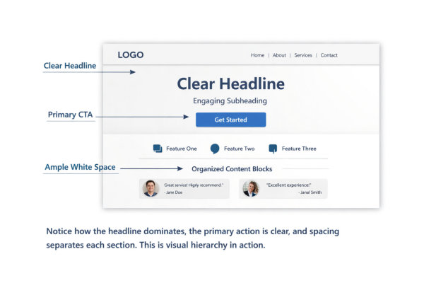
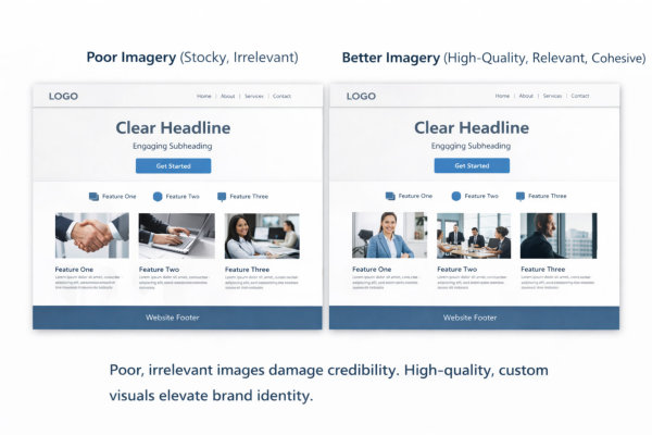
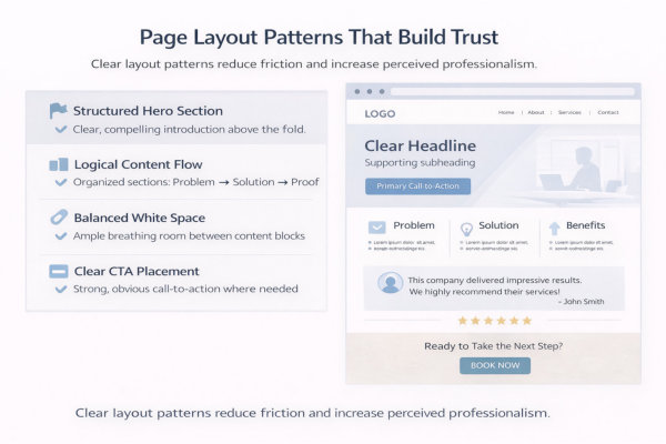
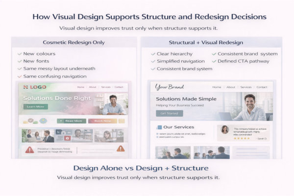
Good visual design creates clarity. It guides attention, highlights what matters, and makes your content easier to take in. It also builds trust. When a website looks consistent and intentional, it signals professionalism and credibility.
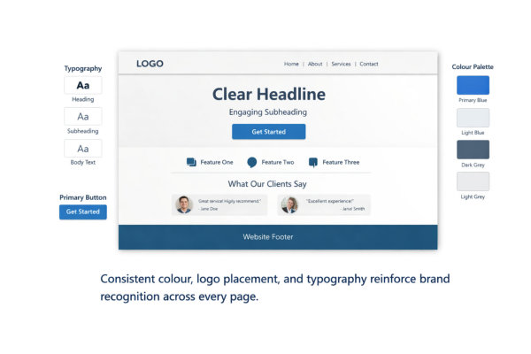
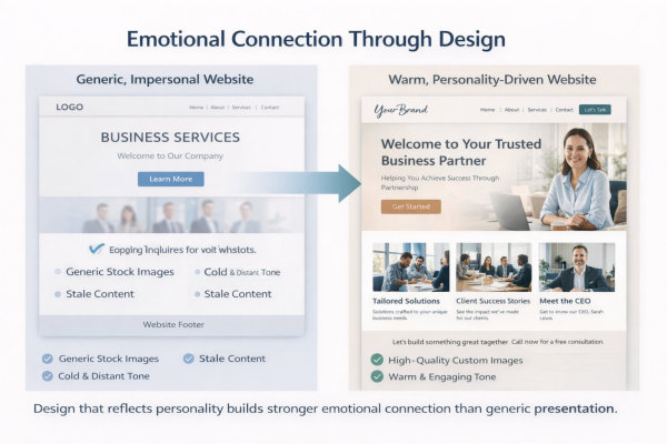
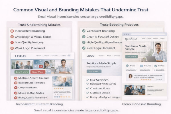
Branding sits underneath all of this. It’s what gives your website a recognisable feel. Not just a logo, but the way everything works together – colours, typography, imagery, spacing, and tone. When these elements are aligned, your website feels cohesive. When they’re not, it feels disjointed, even if the design looks “nice” on the surface.
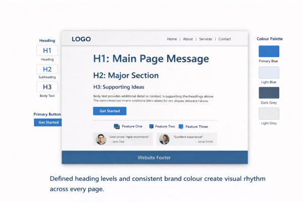
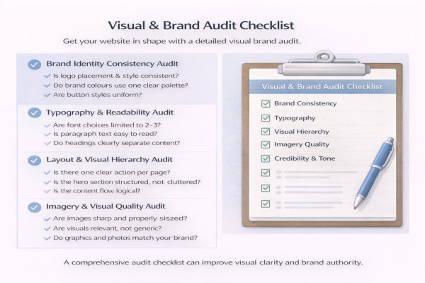
This page breaks down how visual design and branding work together in a practical way. You’ll see how to create clear visual hierarchy, how to translate your brand into a consistent visual system, and how to use layout, imagery, and styling choices to support trust and connection.
If your website looks fine but doesn’t feel quite right, or if it’s not leaving a strong impression, this is usually where the gap is. Once your visual direction is clear, everything else becomes easier to align.


