Landing Pages & Sales Pages
Turning Interest into Action
This guide forms part of our complete resource on Small Business Website Conversion & Growth.
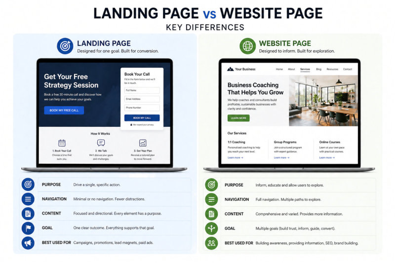
Not every page on your website is designed to do the same job. Some pages inform, some build trust, and others are designed to drive a specific action.
Landing pages and sales pages fall into that second category. They are focused, intentional, and built to guide visitors toward a clear outcome without distraction.
Many small business websites rely too heavily on general pages and miss the opportunity to create targeted experiences for specific offers, campaigns, or services. This often results in lost enquiries and lower conversion rates.
This guide forms part of our complete resource on Website Conversion & Growth: Website Conversion & Growth.
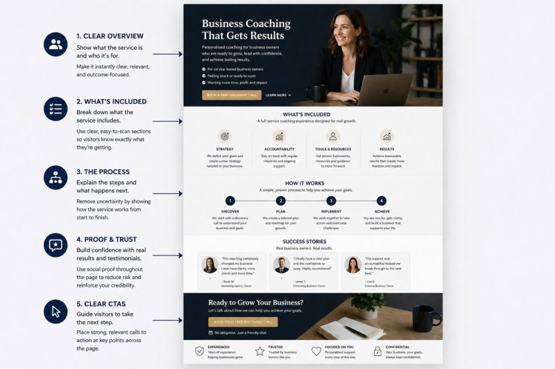
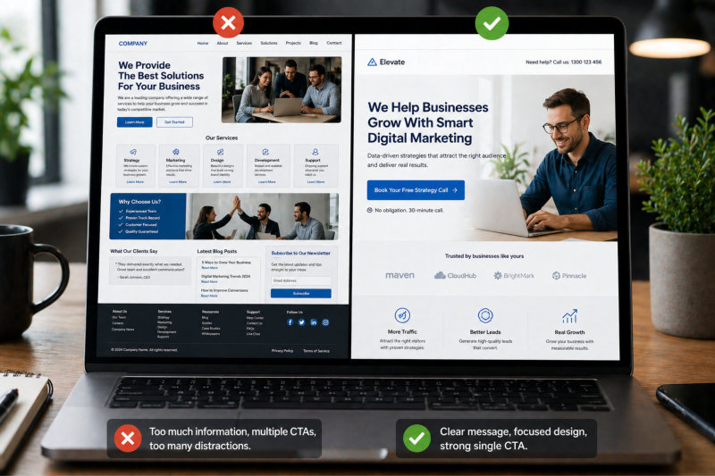
You’ll learn what landing pages are, how they differ from standard website pages, and how to structure them so they actually convert. You’ll also see when to use them, what to include, and the common mistakes that reduce their effectiveness.
If your website is not converting as well as it should, landing pages are often one of the most overlooked opportunities to improve results.
Not every page on your website is designed to do the same job. Some pages inform, some build trust, and others are designed to drive a specific action.
Landing pages and sales pages fall into that second category. They are focused, intentional, and built to guide visitors toward a clear outcome without distraction.
Many small business websites rely too heavily on general pages and miss the opportunity to create targeted experiences for specific offers, campaigns, or services. This often results in lost enquiries and lower conversion rates.
This guide forms part of our complete resource on Website Conversion & Growth: Website Conversion & Growth.
You’ll learn what landing pages are, how they differ from standard website pages, and how to structure them so they actually convert. You’ll also see when to use them, what to include, and the common mistakes that reduce their effectiveness.
If your website is not converting as well as it should, landing pages are often one of the most overlooked opportunities to improve results.