The Importance of User Experience (UX) in Web Design
Ever jumped onto a website that looked like it was touched by Michelangelo but navigated like a blindfolded game of hide and seek? We’ve all been there, haven’t we?
That’s the harsh reality of the wild, often misunderstood world of user experience, or UX for those in the biz. It’s the unsung hero of every great website. It guides us from the anguish of digital frustration to the haven of intuitive, easy browsing.
When it’s good, we glide through websites, barely noticing how we reach our destination. When it’s bad, we’re like Alice down the rabbit hole, lost in a puzzling world of endless clicks and dead ends.
Having a stunning website isn’t enough. It’s the experience that counts. It’s the difference between a user who visits and bounces and a user who visits and converts – the tight gap between a one-time visitor and a loyal customer.
So, it’s about time we pulled back the curtain on the fascinating but often overlooked world of user experience. Let’s explore the magic behind the scenes and uncover why UX is the secret ingredient that can make or break a website’s success.
Misconceptions about Web Design
Don’t judge a website by its cover. When web design pops into your head, chances are you’re picturing a digital artist, their canvas bristling with stunning visuals and breathtaking graphics. Aesthetics are the king of the castle, and who can blame you?
But web design is a lot like an iceberg. The part you see, the user interface (UI), is just the tip basking in the sunshine. The real mammoth, UX, is submerged, silently but significantly influencing everything from your click-through rates to your users’ ability to swiftly locate whatever they’re looking for.
Web design isn’t just about the digital beauty pageant; it’s about function, usability, and that warm, fuzzy feeling you get when a website just works. That’s UX for you – the silent conductor orchestrating the symphony of smooth browsing.
Understanding User Experience
So, what’s UX in a nutshell?
Imagine it’s your task to host a mega party. You’ve got to ensure the drinks are easy to find, the layout makes sense, and no one ends up locked in the bathroom. You’ve got to anticipate needs before they arise and deliver solutions before problems surface. In essence, that’s UX.
Good UX is the wizard behind the curtain, making your seamless binge-watch session on Netflix possible, ensuring you can easily navigate the labyrinth of Amazon’s product range, or allowing you to scroll effortlessly through Facebook’s endless feed.
Bad UX is, well, revealed every time you’ve yelled at your screen in frustration, regretted clicking on a link, or abandoned a shopping cart. It’s not just about making things look pretty; it’s about making them work beautifully, thoughtfully, and efficiently.
UX is the lifeblood of any successful website. Without it, even the most visually impressive website is like a Lamborghini without an engine – it might look fabulous, but it won’t take you anywhere.
Consider the case of Notion, an all-in-one digital workspace where you can plan, write, collaborate, and get all of your work organized. It’s like a digital Swiss Army knife, and with so many functionalities, things could easily get overwhelming. But they don’t, and that’s largely thanks to Notion’s strong emphasis on UX.
When you land on their site, you’re not assaulted by a barrage of features and options. Instead, you’re eased into the experience with a clean layout, intuitive navigation, and clear, concise copy. It’s a prime example of UX done right. With the user’s needs at the center of the design, what could have been a complex, confusing platform becomes a streamlined, user-friendly experience.
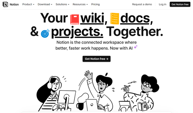
Image source: Notion.com
Core Principles of User Experience
UX design is a bit like making a cupcake for a picky customer. It’s all about the layers:
- accessibility (providing the softest dough – fulfilling everyone’s basic criteria)
- usability (adding a delicious filling – making everyone enjoy their time)
- user-centred design (finishing with a tasty frosting – completing each experience).
It’s about ensuring everyone can finish the cupcake and enjoy it, regardless of their dietary restrictions or personal preferences.
Accessibility ensures that everyone can navigate your site, regardless of their age, technical prowess, or any disabilities.
Usability, on the other hand, is all about making your website user-friendly. No one wants to solve a Rubik’s cube just to find your contact details.
User-centred design is about looking at your site through the users’ eyes, understanding their needs, expectations, and preferences.
Good UX is like a perfect cupcake – every layer works together to deliver an experience that’s satisfying and leaves you wanting more.
Empathy in UX Design
UX design’s secret ingredient?
A healthy dose of empathy.
It’s like being a mind reader but without the mystical ambience or the wacky crystal ball. Knowing your users, their behaviours, their needs, and their wants is the key to designing an experience that fits like a glove.
Great UX designers are like digital detectives, using tools like user research, testing, and a sprinkle of intuition to unearth what users really want. It’s not enough to think your design is intuitive or user-friendly – you need to put it to the test with actual users.
Only then can you truly understand their pains and joys and learn how to make your website a digital home for them.
Transformative Examples of User Experience
UX might not be a magic wand, but its effects can certainly feel magical. By empathizing with users, we can design experiences that not only meet their needs but also anticipate them, making browsing a delight rather than a chore.
For an impressive example of UX done right, let’s take a look at Mailchimp. You might think that an email marketing service could easily get lost in the weeds of complexity, but Mailchimp successfully overcame those obstacles and redesigned their website to be more user-friendly.
From their fun, engaging visuals to their intuitive interface, Mailchimp has managed to turn a potentially daunting process into a breeze. Even though their website functioned properly before, the emphasis on their value proposition is much more evident with the new redesign.
They’ve also made it simple to create campaigns, manage mailing lists, and track results, all within a cheerful, approachable environment. That’s the power of good UX.
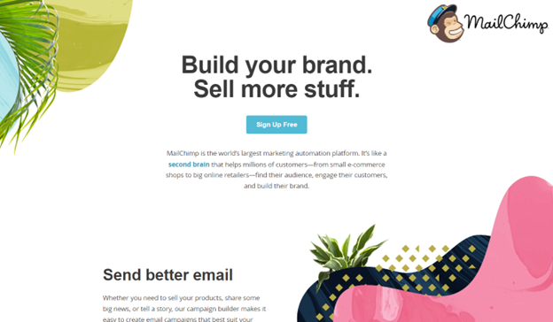
Image source: Mailchimp.com (before redesign)
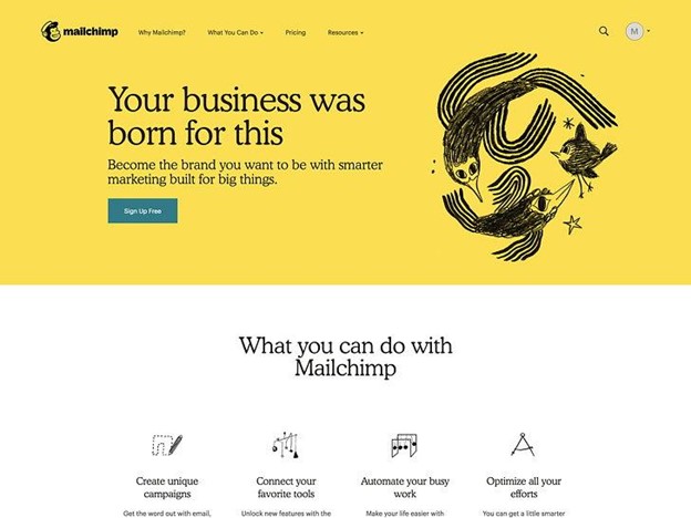
Image source: Mailchimp.com (after redesign)
On the flip side, consider the infamous redesign of Snapchat in early 2018. With the goal of separating social interactions from media content, the Snapchat team rolled out a new design that ended up confusing and frustrating many of its users. The interface was deemed less intuitive and harder to navigate, leading to a significant backlash from its user base.
In fact, over 1.2 million users even signed a petition requesting the company to revert to its old design. This event served as a stark reminder that change isn’t always a good thing, especially when it comes at the expense of user experience.
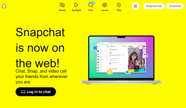
Image source: Snapchat.com
These examples illuminate the transformative power of UX design. When done right, like in Mailchimp’s case, it can simplify complex processes, increase user engagement, and set a platform up for success. When done wrong, as with Snapchat, it can lead to user frustration and negative publicity; it can even impact a platform’s growth.
The Business Impact of UX
Now, let’s talk turkey. Investing in UX might feel like splurging on a gold-plated coffee machine. Nice to have, but is it necessary? Here’s the kicker: studies show that every $1 invested in UX brings $100 in return.
And that’s not even considering the long-term benefits, like increased customer loyalty and reduced development costs. Great UX makes your users happy, and happy users are more likely to become repeat customers, recommend your site to others, and spend more. When it comes to business, good UX isn’t a luxury – it’s a necessity.
Plus, by understanding your users’ needs from the get-go, you can avoid costly redesigns down the line. As the old saying goes, “An ounce of prevention is worth a pound of cure.”
Let’s dive into a real-life example. Take a look at the BaseLang homepage. This language learning platform has clearly invested in UX, and it shows. The site is easy to navigate, the information is presented clearly, and the learning journey is mapped out intuitively. As a result, users feel supported, understood, and more likely to invest time and money into the platform’s services.
What does this mean in terms of ROI for them? Well, the positive user experience increases user engagement, reduces bounce rates, and nurtures customer loyalty. All these factors positively impact the bottom line.
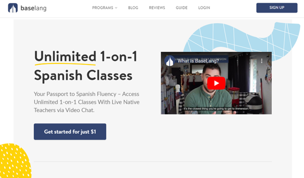
Image source: Baselang.com
The Concepts of Great UX Design
So, we’ve seen the magic of UX design in action, and we’ve talked about its impact on business. But what does good UX design actually entail? While it can seem like an elusive art form, it boils down to a few fundamental principles.
- Understand your user.
This is the golden rule of UX design. Understand who you’re designing for, what they need, and how they behave. User research, personas, and user testing are key tools in a UX designer’s arsenal. - Simplicity is key.
In the wise words of Leonardo da Vinci, “Simplicity is the ultimate sophistication.” Avoid unnecessary complexity and make sure your website is easy to navigate and that information is clear and concise. - Consistency matters.
Keep your design elements and interactive components consistent across your website. This helps users learn how your website works, making navigation smoother and faster. - Feedback is vital.
Whether it’s hover effects, loading animations, or confirmation messages, always let users know what’s happening. This helps them feel in control and reduces confusion. - Ensure accessibility for all.
Good UX design is inclusive. It ensures that everyone, including people with disabilities, can use your website effectively. This involves considerations like color contrast, font size, and keyboard navigation.
Take Canva, for example. They’ve nailed all of these principles with their intuitive, consistent, and accessible design. It’s how they’ve come a long way from being a tiny design tool to an online powerhouse for everyone needing quick digital designs.
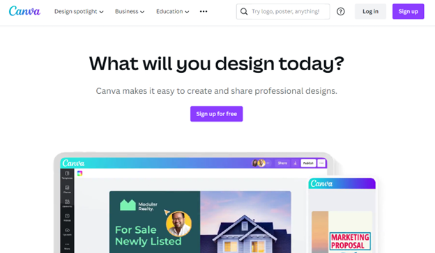
Image source: Canva.com
Or for another example check out the homepage of Shop Solar Kits. The alternative energy brand nails the colour scheme by using orange throughout the page, which is a popular colour choice for solar companies. The logo, header, CTA, and icons clearly stand out as a result and form a cohesive brand image.

Image source: Shopsolarkits.com
Final Thoughts
So there you have it. UX isn’t just the unsung hero of web design; it’s the rockstar, performing sell-out shows in the background.
Above, we’ve learned that UX isn’t about creating a website that just looks good but about creating a website that feels good. A website that anticipates your needs, meets you where you are, and takes you where you want to go.
And in today’s digital age, that’s what really hits the high notes. So, next time you’re building a website, ask yourself: “How can I make my users’ lives easier?” Along the way, remember that good UX design isn’t a ‘set it and forget it’ deal. It’s a continuous process of learning, iterating, and improving.
So, keep your ears to the ground, listen to your users, and always be ready to adapt and evolve. After all, in the fast-paced world of web design, the only constant is change.