Website Visual Design & Branding
This guide forms part of our complete Small Business Website Design & Redesign resource, where we break down every major component of building a high-quality website.


This guide forms part of our complete Small Business Website Design & Redesign resource, where we break down every major component of building a high-quality website.
The top section of a website works like a storefront window. Within seconds, visitors decide whether to step inside or walk past. A clear visual hierarchy begins here. The headline should dominate the space, supported by a short explanatory sentence and one obvious action button.
If five elements compete for attention at the top – multiple buttons, large sliders, conflicting messages – the brain stalls. When the brain stalls, people leave. Clarity reduces friction.
Think of it like walking into a reception area. If the signage clearly directs you where to go, you feel confident. If there are five arrows pointing in different directions, trust drops immediately.
Strong above-the-fold structure answers three silent questions quickly: Who is this for? What do they offer? What should I do next?
Not all text deserves equal attention. Visual hierarchy uses size and contrast to signal importance. Headings must stand out clearly from body text, and primary headings must dominate secondary ones.
If every font is similar in size and weight, the page feels flat. Visitors are forced to read line by line instead of scanning. Most people do not read websites in sequence – they scan for signals.
Imagine opening a newspaper where every headline and paragraph is printed in the same size. It would feel overwhelming and difficult to navigate. Websites behave the same way.
Clear dominance in headings, subheadings, and supporting text creates a rhythm. That rhythm allows visitors to move naturally down the page without effort.
White space is often misunderstood as wasted space. In reality, it is structural space. It separates ideas, improves readability, and increases perceived professionalism.
Crowded layouts create tension. When elements are pushed too closely together, the page feels rushed and chaotic. Generous spacing communicates confidence and control.
Consider the difference between a luxury boutique and a discount warehouse. In a boutique, products are spaced carefully. Each item has room to breathe. The same principle applies to website sections, images, and buttons.
Spacing between headings and paragraphs, margins around images, and padding inside content blocks all contribute to hierarchy. White space guides the eye without shouting.
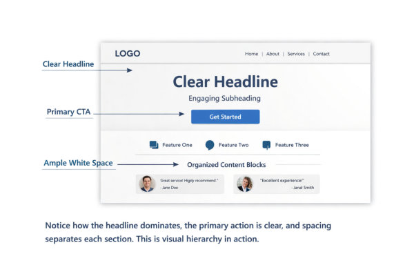
Calls to action are part of visual structure. Their effectiveness begins with design clarity, not persuasion techniques. Buttons should contrast clearly against their background and remain consistent in style across the site.
If every button uses a different colour or size, priority disappears. Visitors hesitate because nothing stands out as the main action. Visual hierarchy should make the primary action obvious without forcing the user to search for it.
Think of traffic lights. Red, amber, and green are consistent everywhere. You do not stop to interpret what they mean. Good website hierarchy creates similar instant recognition.
Button placement, size, and contrast all signal importance. When done correctly, action feels natural rather than forced. Find out more about calls to action for your website
Long walls of text weaken hierarchy. Breaking content into structured blocks improves scanning and comprehension. Subheadings, short paragraphs, bullet points, and visual separators all help users process information quickly.
Visitors rarely read every word. They look for signals that match their intent. Well-defined content blocks act like signposts on a walking trail. Each section tells them what they will find next.
Without structure, even valuable content feels heavy. With structure, complex ideas become manageable. If you want a deeper breakdown of internal layout improvements, see our guide on improving the design of internal web pages.
Visual hierarchy is not decoration. It is organisation. When sections are clearly defined and visually separated, users feel guided rather than overwhelmed.
Your website is often the first impression someone has of your business. Before they read a single sentence, they’ve already formed an opinion.
If your branding feels inconsistent, outdated, or generic, visitors subconsciously question credibility. If it feels cohesive and intentional, trust increases immediately.
Think of walking past two cafés:
Even without tasting the coffee, you already have a preference.
Brand identity online works the same way. Visual consistency signals professionalism. Inconsistency signals uncertainty.
Your website should visually reflect who you are and who you serve.
A logo is not decoration. It is a visual anchor. If you are unsure whether your logo is being used correctly, or whether it reflects your brand professionally, see our guide on what you need to know about business logos.
Strong brand identity ensures your logo:
A tiny logo buried in the corner weakens recognition. An oversized logo dominating the page feels insecure.
Consistency builds familiarity. Familiarity builds trust.
Your logo should feel confident and deliberate – not like it was added as an afterthought. Learn about our logo design services.
Colour is one of the fastest emotional triggers in branding. It communicates tone before words are read.
A cohesive palette usually includes:
When every page uses different accent colours, hierarchy disappears. It feels unstable.
Imagine a restaurant where every room has a completely different theme. It would feel disjointed. Your website should feel unified from page to page.
Consistency in colour strengthens recognition and reinforces brand memory.
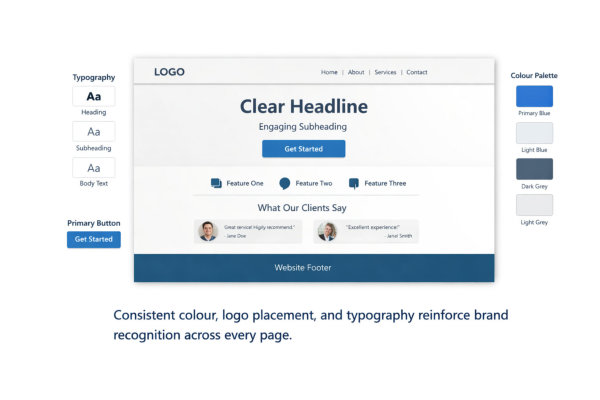
Fonts communicate personality.
A serif font can feel traditional or established. A clean sans-serif may feel modern and accessible. A script font might feel elegant or creative.
But mixing too many styles weakens authority.
Strong typography systems:
If your headings feel corporate but your body text feels playful, the brand becomes confused.
Typography should align with the business tone – not fight against it.
Brand identity is not built on one page. It is reinforced through repetition.
Ask yourself:
When elements change style randomly, it feels unplanned.
A strong brand feels steady. It doesn’t reinvent itself on every page.
Visual tone consistency turns a collection of pages into a cohesive brand experience.
More fonts do not make a website more creative. They make it chaotic.
Most strong websites use:
When a site uses five different typefaces, it feels uncoordinated. It’s like attending a business meeting where everyone is wearing a completely different dress code. There is no visual agreement. This is why disciplined branding works best – if you want a deeper look at why simplicity strengthens visibility, see our guide on keeping your branding simple to stand out.
Limiting fonts creates structure. It helps visitors subconsciously recognise patterns across pages.
Consistency also improves readability. When headings always look the same, users know instantly what level of importance they’re looking at.
Strong typography systems are deliberate, not decorative.
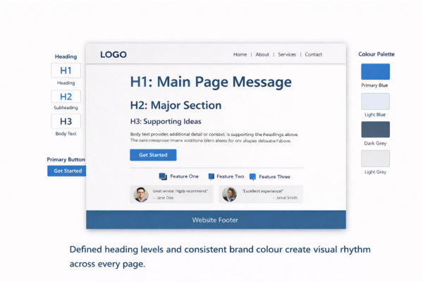
Headings are not just bigger text. They are structural signals.
A clear hierarchy typically follows:
If headings randomly change size or weight, users lose orientation.
Imagine reading a book where chapter titles are sometimes smaller than paragraphs. It would feel disorganised.
Clear hierarchy improves scanning. Visitors don’t need to read everything. They can skim confidently and stop where it’s relevant.
Typography hierarchy is silent guidance.
Colour is one of the fastest ways to create recognition.
Strong systems usually include:
If your primary button changes colour from page to page, brand consistency disappears.
Think about global brands. Their primary colour becomes instantly recognisable. You don’t need to see the logo to know who it is.
Your website doesn’t need to be bold. It needs to be consistent.
Colour repetition reinforces memory.
Typography is not just about style. It’s about legibility.
Strong contrast means:
Low contrast feels modern but often sacrifices usability.
Imagine trying to read a restaurant menu in dim lighting with faded print. Frustration rises quickly.
Good contrast reduces effort. Reduced effort increases trust.
Accessibility is not just ethical – it strengthens brand professionalism.
Typography and colour systems must hold together on:
Font scaling, button spacing, and colour visibility change across screens. A button that looks bold on desktop might look weak on mobile.
Test consistency.
If typography collapses or colours feel different across devices, brand identity weakens.
Strong systems are flexible but consistent.

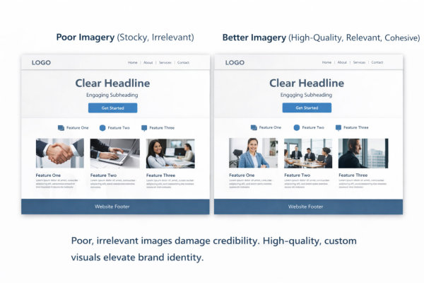
Visitors process images faster than text. Before they read your headline, they’ve already formed a judgment about professionalism.
High-quality imagery communicates:
Low-quality or irrelevant images communicate the opposite.
If a financial consultant uses blurry handshake stock photos, it weakens trust. If a wellness coach uses cold corporate imagery, it confuses positioning.
Images should reinforce your message, not dilute it.
Strong imagery aligns with who you are and who you serve.
Your imagery should feel like it belongs to the same brand.
Ask yourself:
When imagery style shifts dramatically between pages, it feels disjointed.
Consistency builds familiarity. Familiarity builds confidence.
If one page feels corporate and another feels playful, your brand loses cohesion.
Imagery is part of your visual system, not an afterthought.
Stock images are not inherently bad. Random stock images are.
Poor imagery often looks like:
Strategic imagery looks like:
The difference is intention.
When visuals are chosen strategically, they feel integrated. When they’re chosen quickly, they feel filler.
AI-generated imagery can be powerful when used intentionally.
It allows small businesses to:
Learn about AI-generated images for your business website
But AI images must still follow brand rules.
If AI visuals don’t match your typography, colour palette, or tone, they create visual friction.
AI is a tool. Strategy is the difference.
Used correctly, it gives small businesses creative flexibility without enterprise budgets.
There are moments where professional photography makes a measurable difference:
Real images increase authenticity.
Seeing the actual business owner, the real workspace, or genuine client interactions builds connection.
If your business relies on trust, photography is not a luxury. It’s an asset
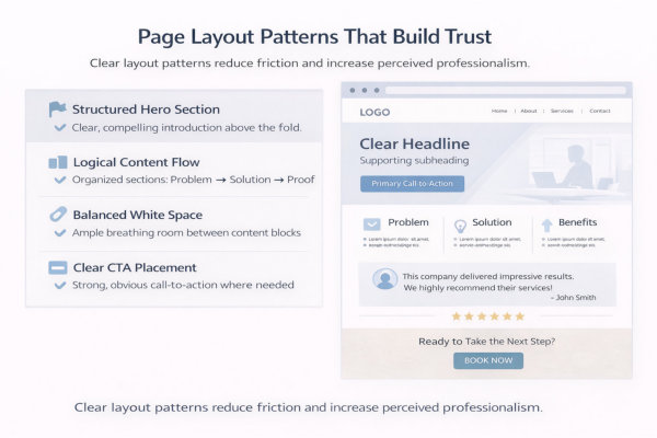
The top of your page carries disproportionate weight.
Within seconds, visitors assess:
A strong hero section typically includes:
Problems we often see:
A weak hero creates doubt immediately.
A strong hero reduces uncertainty and signals confidence.
This connects directly to structural clarity. If you want to understand how layout ties into navigation and hierarchy, revisit the Website Structure & UX guide.
Trust increases when information unfolds in a logical order.
Most high-performing service pages follow a psychological sequence:
Identify the problem
Present the solution
Explain benefits
Provide proof
Offer a clear next step
When this order is scrambled, friction increases.
For example:
That creates subtle resistance.
Structured progression mirrors how people make decisions.
Layout is storytelling through placement.
White space is a strategic trust tool.
Overcrowded layouts create subconscious stress.
Common issues:
White space does three important things:
Luxury brands use generous spacing for a reason. It communicates that nothing is rushed or desperate.
Small businesses often try to “say everything.” But clarity is more persuasive than volume.
Predictable layouts build psychological safety.
Repetition reduces cognitive load.
Examples of healthy repetition:
When each page invents its own layout style, visitors lose orientation.
Imagine walking through a shopping centre where every store rearranged the aisles randomly. It would feel chaotic.
Predictability creates stability.
Stability builds trust.
Trust declines when users feel pushed or confused.
Strong layout patterns use:
Weak layout patterns:
Confusion signals inexperience. Clarity signals authority.
If your CTA placement feels inconsistent, that often indicates a deeper structural issue. It may be worth reviewing your broader Website Redesign & Update section to ensure alignment between design and structure.
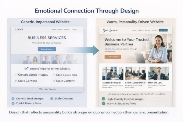
People do not choose businesses purely based on information. They choose based on feeling.
Before they compare features or pricing, they subconsciously assess:
Colour tone, spacing, imagery, typography and voice all influence that reaction.
Two businesses can offer identical services. The one that feels more aligned will win.
Design influences emotion first. Logic comes later.
Many small businesses accidentally create a “safe but invisible” website.
It looks fine. It functions fine. But it says nothing distinct.
Strong personality branding clarifies:
When personality is unclear, your website blends in. If you haven’t defined what makes your brand distinct beyond colours and fonts, read our guide on Personality Branding – The Third Brand Your Business Needs to clarify the emotional layer of your business identity.
Your visual tone should reinforce that personality consistently.
Emotional connection is strengthened when visitors feel valued.
Trust-building elements include:
When appreciation is built into your brand language and presentation, visitors feel acknowledged.
Emotional connection deepens when visitors feel acknowledged and valued. We explore this further in Creating Emotional Connections: The Role of Appreciation in Branding Success, where we break down how appreciation strengthens trust.
Design is not just layout. It is relational.
When visitors feel understood, they stay longer and engage more confidently.
When a website feels inconsistent, users hesitate.
Inconsistency triggers subtle doubt:
Consistency creates psychological safety.
That includes:
When everything feels intentional, visitors relax.
Relaxed visitors convert more confidently.
Emotional connection depends on alignment.
Ask yourself:
A corporate executive expects a different aesthetic than a creative entrepreneur.
If design tone mismatches audience expectations, friction increases.
Design should attract the right people and gently repel the wrong ones.
That is clarity, not exclusion.
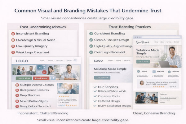
One of the fastest ways to erode trust is inconsistency.
Examples:
Visitors may not consciously identify the issue, but they feel instability.
Strong brands repeat visual signals intentionally.
If your design rules shift between pages, it signals a lack of structure.
Many small businesses try to “look impressive.”
The result often includes:
Visual noise reduces clarity.
Clarity builds trust.
If everything is highlighted, nothing stands out.
Simple, controlled design communicates confidence.
Imagery mistakes are common:
If you’re unsure whether your imagery strengthens or weakens credibility, revisit Stock Photos vs. AI-Generated Images to understand how strategic visuals influence perception.
Images should reinforce your positioning.
Poor imagery undermines it immediately.
Your logo should act as an anchor.
Common issues:
Your logo does not need to dominate the page, but it must look intentional.
If you’re unsure whether your logo is optimised for digital use, review Need a Business Logo? Here Is What You Need to Know for guidance on correct application.
Poor logo handling signals inexperience.
Trust declines when personality shifts unexpectedly.
Examples:
Your visual tone should match your brand positioning.
If your personality is unclear, it becomes harder for the right clients to recognise themselves in your brand. This is explored more deeply in Personality Branding – The Third Brand Your Business Needs.
Clarity attracts. Confusion repels.
Your goal is simple – a visitor should feel like every page belongs to the same business.
Check:
What “good” looks like:
If it fails, fix this first:
Brand consistency is the foundation. Everything else sits on top of it.
Typography problems often show up as “something feels off” – even if nobody can explain why.
Check:
What “good” looks like:
If it fails, fix this first:
Typography is silent professionalism.
This is the “can someone find what they need without effort?” test.
Check:
What “good” looks like:
If it fails, fix this first:
Hierarchy is clarity. Clarity is trust.
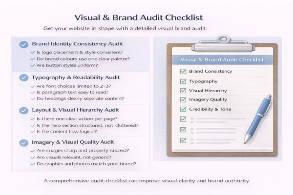
Imagery is often the quickest credibility giveaway.
Check:
What “good” looks like:
If it fails, fix this first:
Better to have three strong visuals than twelve weak ones.
This is the subtle part – does your design feel aligned with your business and your ideal client?
Check:
What “good” looks like:
If it fails, fix this first:
Your website should feel like a calm, confident handshake – not a frantic sales pitch.
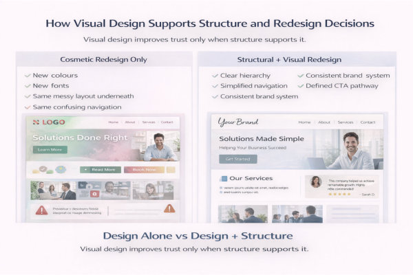
Structure defines order.
Design makes that order visible.
For example:
If structure is strong but visual hierarchy is weak, clarity collapses.
If you want a deeper look at structural foundations, revisit the Website Structure & UX cluster, where navigation, hierarchy and content flow are mapped in detail.
Visual design is the visible layer of structure.
Sometimes design exposes structural weaknesses.
Common signs:
When a client says “It just doesn’t feel right,” the issue is often structural before it’s visual.
Design can’t fix broken structure. It can only highlight it.
Inconsistent visual systems are often early indicators that a redesign is needed.
Look for:
These inconsistencies reduce perceived professionalism.
If you’re evaluating whether your site needs a rebuild rather than cosmetic updates, explore the Website Redesign & Updates guide for guidance on timing and migration decisions.
Redesign should be strategic, not reactive.
Redesign decisions often involve platform considerations.
Different platforms offer different levels of:
If your current platform limits visual consistency, you may be fighting the system rather than improving design.
Platform choice influences how easily you can maintain brand discipline.
Design sustainability matters.
Strong visual systems reduce long-term maintenance effort.
When your site has:
Future updates become faster and safer.
Without systems, every new page becomes a mini redesign.
Design discipline lowers risk and increases efficiency.
What’s the difference between branding and visual design?
Branding is the overall identity of your business – how you position yourself, how you sound, what you stand for.
Visual design is how that identity appears on your website.
Branding includes:
• Your values
• Your tone of voice
• Your positioning
• Your personality
Visual design includes:
• Logo
• Colour palette
• Typography
• Imagery
• Layout patterns
If branding is unclear, visual design becomes inconsistent.
If visual design is inconsistent, branding feels weak.
They are connected, but not the same thing.
Do I need a full rebrand if my website looks outdated?
Not always.
Ask yourself:
• Is the structure still working?
• Is navigation clear?
• Is messaging strong?
• Or does it just “look old”?
Sometimes small updates work:
• Updated typography
• Refined colour palette
• Improved imagery
• Cleaner spacing
But if:
• Branding has changed
• Services have evolved
• Pages were built years apart
• Layout feels fragmented
Then a structured redesign may be more efficient than patchwork updates.
Cosmetic changes can only go so far.
How many fonts should a small business website use?
Ideally two. Sometimes three.
Typical system:
• One heading font
• One body font
• Optional accent font (sparingly)
More than that creates visual noise.
Consistency increases perceived professionalism.
Too many fonts create distraction.
Can I use stock photos, or do I need professional photography?
Stock photos are fine – if used intentionally.
The problem is not stock imagery.
The problem is generic imagery.
Avoid:
• Fake handshake photos
• Overused office scenes
• Random abstract graphics
Use:
• Images relevant to your industry
• Consistent lighting and tone
• Real photos where credibility matters (About page, testimonials, team)
Three strong images are better than twenty weak ones.
How do I know if my website design is undermining trust?
Look for these warning signs:
• Inconsistent button styles
• Mixed font usage
• Uneven spacing
• Low-quality images
• Multiple competing calls to action
• Pages that feel visually unrelated
If visitors hesitate, scroll back up, or struggle to find what to do next – design clarity may be the issue.
Trust is often lost in small visual inconsistencies.
Should design follow trends?
Short answer: cautiously.
Trends change quickly.
Trust builds slowly.
Instead of chasing trends, focus on:
• Clarity
• Simplicity
• Readability
• Consistency
• Strong hierarchy
A clean, well-structured site ages better than a trendy one.
Your goal is credibility, not novelty.
How often should a website’s visual design be updated?
There is no fixed timeline.
However, review your design if:
• Your branding has evolved
• You’ve added new services
• You’ve changed audience positioning
• The site looks inconsistent
• Your competitors feel more current
A structured audit every 18–24 months is reasonable.
Minor refinements are better than emergency rebuilds.
Does visual design really affect conversions?
Yes – indirectly.
Visual design affects:
• First impressions
• Perceived professionalism
• Ease of navigation
• Emotional comfort
• Trust signals
People don’t convert because colours are pretty.
They convert because the experience feels clear and safe.
Design reduces friction.
And reduced friction increases action.
Visual design is not about making a website look “nice.”
It is about making structure visible, reinforcing brand identity, and guiding decision-making with clarity.
When hierarchy is clear, branding is consistent, typography is readable, imagery is intentional, and layout patterns are predictable, something important happens:
Your website feels trustworthy.
Not louder.
Not trendier.
More stable. More confident. More aligned.
Strong visual systems also reduce future redesign costs. When your design rules are defined, updates become easier, pages stay consistent, and growth does not require rebuilding from scratch.
If you want help applying these visual design and branding principles to your own website, you can explore our Website Design & Redesign Services.
Design should support structure.
Structure should support clarity.
Clarity builds trust.
And trust drives decisions.

