Website Layouts and Templates
How to Structure Your Website for Better Results

This guide forms part of our complete resource on Small Business Website Design.

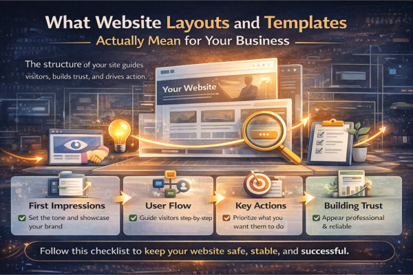
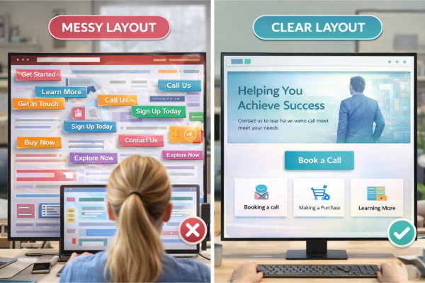
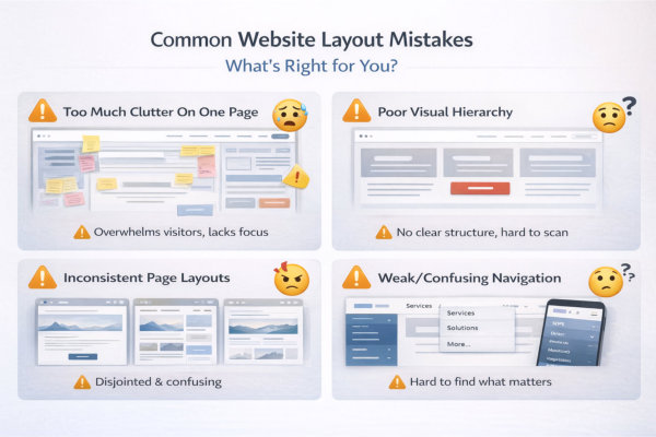
Your website layout is one of the most important decisions you will make, yet it is often treated as a purely visual choice. In reality, the way your website is structured has a direct impact on how users experience your content, how they perceive your business, and whether they take action.

A well-planned layout helps visitors understand what you offer, navigate your website with ease, and move naturally toward making an enquiry. A poorly structured layout, on the other hand, can create confusion, reduce trust, and cause users to leave before they fully engage with your content.

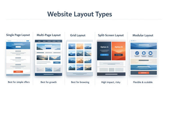
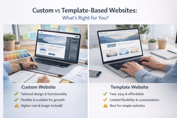
Templates play a key role in this process by providing a starting framework. However, choosing the right template and adapting it correctly requires more than simply selecting a design that looks appealing. It involves understanding how layout supports your goals, your audience, and your overall website strategy.

This guide will help you understand what website layouts and templates actually mean for your business, how to choose the right structure, and when to customise or adjust your approach. You’ll also learn how layout influences user experience, branding, and performance, along with the most common mistakes that can reduce your results.

If your website is not performing as well as it should, layout is often a key factor. Getting this right creates a stronger foundation for everything else on your site, from content and design through to conversions and growth.

Website layouts and templates

What Website Layouts and Templates Actually Mean for Your Business

Website Layout Is the Backbone of How Your Business Is Experienced Online

Your website layout is not just a visual decision – it is the structural framework that controls how every piece of content is presented, prioritised, and consumed. It dictates what users see first, how they move through your site, and whether they understand what you offer within seconds.

For small businesses, this matters more than you think. You do not have unlimited attention from visitors. If your layout does not immediately guide them, they will leave. A strong layout acts like a silent salesperson – leading visitors from interest to action without confusion or friction.

This is why layout should always be approached as a business decision, not just a design preference. It directly influences engagement, trust, and ultimately whether someone contacts you or clicks away.

Templates Give You a Starting Point – But Not a Complete Solution

Website templates are designed to make the process faster and more accessible. They provide a pre-built structure, styling, and layout patterns that can be adapted for different industries. For many small business owners, this can feel like an easy win.

However, templates are generic by nature. They are not built around your specific services, your audience, or your goals. If you simply “fill in the blanks,” you often end up with a website that looks fine but does not perform well.

The real value comes from how you adapt the template. This requires planning your content, restructuring sections where needed, and removing anything that does not serve your business. If you skip this step, you risk building a site that looks complete but fails to deliver results.

Before choosing any template, it is worth understanding how to plan your website before you start building it so your structure supports your goals from day one.

What website layouts mean for your business

Your Layout Directly Influences How People Navigate and Take Action

Every layout decision you make affects how users move through your website. Navigation menus, page hierarchy, spacing, and content flow all contribute to whether someone feels confident or confused.

A clear layout creates a natural path – from landing on your homepage, to understanding your offer, to taking the next step. This might be booking a call, making an enquiry, or exploring your services further. When this path is obvious, users stay longer and are more likely to convert.

On the other hand, poor layout creates friction. Too many options, unclear sections, or inconsistent structure can overwhelm visitors and cause them to abandon your site. This is not a design issue – it is a structural problem.

If you want to understand how structure supports usability at a deeper level, explore user experience and website structure.

Layout Plays a Critical Role in How Professional and Trustworthy You Appear

Visitors form an impression of your business within seconds. Before they read your content, they are already judging your credibility based on how your website is organised and presented.

A clean, well-structured layout signals professionalism, clarity, and attention to detail. It tells your audience that you know what you are doing and that they can trust you. This is especially important for service-based businesses where trust is a major factor in decision-making.

In contrast, a cluttered or inconsistent layout creates doubt. Even if your services are excellent, a poorly structured website can make your business feel disorganised or outdated.

This is where layout and design work together. For more on how visual elements support your brand, visit visual design and branding.

Fixing a Poor Layout Later Is More Expensive Than Getting It Right Early

One of the biggest misconceptions is that layout can be “fixed later.” In reality, layout issues are rarely small tweaks. They often require restructuring entire pages, rewriting content, and sometimes rebuilding the site altogether.

This leads to additional costs, delays, and frustration – especially if your website is already live and being used by customers. It can also impact your SEO, as structural changes may affect how your content is indexed and ranked.

Taking the time to plan your layout properly from the beginning reduces these risks significantly. It creates a stable foundation that supports your business as it grows, rather than holding it back.

If your current website is not performing or feels difficult to navigate, it may be time to look at website redesign and updates to correct structural issues before they become bigger problems.

Choosing the Right Website Layout for Your Goals and Audience

Your Layout Should Be Driven by What You Want People to Do

Before choosing any layout, you need absolute clarity on what you want your visitors to do. This could be booking a call, making an enquiry, purchasing a product, or simply learning more about your services. Your layout should support that goal from the moment someone lands on your site.

Too many small business websites try to do everything at once. The result is a cluttered layout with competing messages and no clear direction. A focused layout simplifies decision-making for your visitors and increases the likelihood they will take action.

If your goal is not obvious within the first few seconds, your layout is working against you, not for you.

Understand How Your Audience Actually Uses Your Website

Different audiences behave differently online, and your layout needs to reflect that. A coach or consultant’s website will be navigated very differently from an eCommerce store or a service-based trade business.

You need to consider what your audience is looking for, how quickly they want answers, and what information they need before making a decision. For example, some audiences want immediate clarity and reassurance, while others are willing to explore multiple pages before committing.

This is where structure becomes critical. If your layout does not match user expectations, visitors will feel lost or frustrated. For a deeper understanding of how users interact with websites, refer to user experience and website structure.

Match Your Layout to Your Business Model

Your business model plays a major role in determining the right layout. A service-based business often benefits from a clear, linear layout that guides visitors from problem to solution. In contrast, an eCommerce site requires a layout that supports browsing, filtering, and quick purchasing decisions.

Using the wrong layout for your business model creates unnecessary friction. For example, applying a complex, multi-path layout to a simple service offering can overwhelm users, while using an overly simple layout for an eCommerce store can limit functionality and reduce sales.

If you run an online store, it is worth reviewing how to improve your eCommerce website for higher conversions to ensure your layout supports buying behaviour.

Choosing the right website layout

Balance Simplicity with Enough Information to Build Trust

A common mistake is oversimplifying the layout in an attempt to make the site “clean.” While simplicity is important, removing too much content or structure can leave visitors without the information they need to trust you.

Your layout should create a clear flow while still providing enough detail to answer questions, address concerns, and demonstrate credibility. This includes strategically placing testimonials, service explanations, and calls to action throughout the site.

The goal is not minimalism for the sake of aesthetics, but clarity that supports decision-making.

Your Layout Should Support Growth, Not Just Your Current Needs

Many small business owners choose a layout based only on what they need right now. The problem is that as your business grows, your website needs to evolve with it. If your layout is too rigid, it can limit your ability to expand your services, add new content, or improve your marketing.

A well-planned layout allows for flexibility. It gives you room to add new pages, adjust messaging, and refine your structure without needing a complete rebuild. This is especially important if you plan to invest in content, SEO, or new offers over time.

To avoid future limitations, your layout should be considered alongside broader planning decisions. See website cost, budget and planning for how these decisions impact long-term outcomes.

Popular Website Layout Types (And When to Use Them)

Single Page Layouts – Simple, Focused, and High-Converting (When Done Right)

Single page websites are designed to guide users through a complete journey on one page, usually from introduction to call to action. They work well for businesses with a clear, focused offer, such as coaches, consultants, or single-service providers who want to keep things simple and direct.

This layout removes distractions by limiting navigation and encouraging users to scroll in a structured sequence. When done properly, it creates a strong narrative flow that builds understanding and trust step by step. It can be particularly effective for landing pages, campaigns, or businesses that rely on a single primary action such as booking a call.

However, single page layouts can become restrictive as your business grows. They often lack depth for SEO and can make it harder to expand content over time. If you try to force too much information into one page, it can become overwhelming and difficult to navigate.

This is why single page layouts should only be used when your offer is clear and limited. Otherwise, a more structured multi-page approach will give you better long-term flexibility.

Multi-Page Layouts – Structured, Scalable, and Better for Long-Term Growth

Multi-page layouts are the most common and versatile option for small business websites. They allow you to separate content into clearly defined sections such as Home, About, Services, and Contact, making it easier for users to navigate and find relevant information.

This type of layout supports growth. As your business evolves, you can add new pages, expand your services, and create content without disrupting the overall structure. It also provides stronger opportunities for SEO, as each page can target specific keywords and topics.

From a user perspective, multi-page layouts offer clarity and control. Visitors can choose their own path based on what they are looking for, rather than being forced into a single linear experience.

If you are building a business that plans to grow, create content, or target multiple services or audiences, a multi-page layout is almost always the safer and more strategic choice.

Website layout types

Grid-Based Layouts – Ideal for Visual Content and Browsing Experiences

Grid-based layouts organise content into structured blocks, making them ideal for showcasing multiple items at once. You will commonly see this in portfolios, blogs, galleries, and eCommerce product listings where users need to browse and compare options.

This layout works well when your content is visual or when users are exploring rather than making an immediate decision. It allows for quick scanning and helps users identify what interests them without reading large amounts of text.

However, grid layouts require careful planning. If there is no clear hierarchy or if all items look equally important, users may feel overwhelmed or unsure where to focus. Without strong structure, a grid can quickly turn into visual clutter.

To be effective, grid layouts need clear categorisation, consistent styling, and logical grouping. When combined with strong navigation, they can significantly improve usability for content-heavy or product-based websites.

Split-Screen Layouts – Visually Striking but Not Always Practical

Split-screen layouts divide the screen into two sections, often presenting contrasting content side by side. This can be visually engaging and is sometimes used to highlight two key messages, services, or audiences.

While this layout can create a strong first impression, it is not always practical for small business websites. It can complicate navigation, reduce clarity, and make it harder for users to understand where they should focus.

In many cases, split-screen designs prioritise aesthetics over usability. If not executed carefully, they can create confusion rather than clarity, especially on mobile devices where space is limited.

This layout should only be used when there is a very clear reason for presenting two equal options. Otherwise, a more traditional layout will usually provide a better user experience and stronger results.

Modular and Section-Based Layouts – Flexible, Modern, and Highly Adaptable

Modular layouts are built using reusable sections or blocks that can be arranged and customised as needed. This approach has become increasingly popular with modern website builders and themes, as it offers both flexibility and consistency.

For small businesses, modular layouts provide a practical balance between structure and adaptability. You can create pages by combining different sections such as hero banners, service blocks, testimonials, and calls to action, all while maintaining a consistent look and feel.

This makes it easier to update and expand your website over time without needing a complete redesign. You can add new sections, rearrange content, and refine messaging as your business evolves.

However, flexibility can also lead to inconsistency if not managed properly. Without a clear structure, pages can become disjointed or repetitive. This is why modular layouts still require strong planning and alignment with your overall site structure.

When used correctly, this layout type offers one of the best long-term solutions for small businesses looking to grow and adapt without constant rebuilds.

Custom vs Template-Based Websites: What’s Right for You?

Template Websites Are Faster to Launch – But Come with Limitations

Template-based websites are appealing because they reduce time, cost, and complexity. You start with a pre-designed layout, add your content, and your site can be live relatively quickly. For many small businesses, this feels like the most practical option, especially in the early stages.

However, templates are built for broad use, not for your specific business. This means they often include unnecessary sections, generic layouts, and design choices that do not fully align with your brand or goals. If left unchanged, your website can end up looking like many others using the same template.

The biggest risk is not the template itself, but how it is used. Without proper customisation, your website may look complete but fail to clearly communicate what you do or guide users effectively.

Templates are best viewed as a starting point, not a finished solution.

Custom Websites Offer Flexibility – But Require More Planning

A custom website is designed around your specific business, your audience, and your goals. Every section, page, and layout decision is intentional, rather than being adapted from a generic structure. This allows for a more tailored user experience and stronger alignment with your brand.

With a custom approach, you are not limited by predefined layouts or features. You can structure your website in a way that supports your services, messaging, and growth strategy from the outset.

However, this flexibility comes with responsibility. A custom website requires more upfront planning, clearer content, and stronger decision-making. Without this, you can end up with delays, scope creep, and unnecessary complexity.

This is why planning is critical. Before committing to a custom build, review how to plan your website before you start building it to ensure your structure is clear.

The Real Decision Is Not Cost – It’s Fit for Purpose

Many business owners approach this decision purely based on cost. While budget is important, it should not be the only factor. The real question is whether the website structure supports what your business actually needs to achieve.

A low-cost template that does not align with your goals can end up costing more in the long run through missed opportunities, poor user experience, and the need for a redesign. On the other hand, investing in a custom website without a clear plan can lead to unnecessary expense without delivering better results.

The focus should always be on fit for purpose. Does the layout support your services, your audience, and your long-term growth? If not, it is the wrong choice regardless of price.

For a clearer understanding of how cost decisions impact outcomes, see website cost, budget and planning.

Custom vs template based websites

Templates Can Work Well – If They Are Properly Adapted

Templates are not inherently bad. In fact, when used correctly, they can provide a solid foundation for a professional website. The key is in how they are adapted to suit your business.

This means removing unnecessary sections, restructuring content to match your user journey, and aligning the design with your brand. It also involves ensuring that navigation, page flow, and calls to action are clear and intentional.

Many of the issues people experience with template websites come from treating them as “plug and play.” Without thoughtful adjustments, the layout can feel generic and disconnected from your business.

When a template is carefully customised, it can deliver strong results while still keeping costs manageable.

Custom Does Not Mean Complex – It Means Intentional

There is a common misconception that a custom website needs to be complicated or feature-heavy. In reality, the best custom websites are often simple, clear, and highly focused. The difference is that every element is designed with purpose.

A custom layout should remove unnecessary complexity, not add to it. It should make it easier for users to understand your offer, navigate your site, and take action without confusion.

This approach aligns closely with good structure and user experience. If you want to see how layout and usability work together, revisit user experience and website structure.

Ultimately, whether you choose a template or a custom build, the goal is the same – to create a website that supports your business, communicates clearly, and performs reliably over time.

Common Website Layout Mistakes That Hurt Performance

Trying to Fit Too Much Into One Page

One of the most common layout mistakes is trying to include everything on a single page. Business owners often feel they need to explain every service, answer every question, and showcase everything at once. The result is a long, cluttered page with no clear focus.

This overwhelms visitors and makes it difficult for them to understand what matters most. Instead of guiding users, the layout creates confusion and decision fatigue. People do not read everything – they scan. If your structure does not prioritise key information, important messages get lost.

A better approach is to break content into clear sections or separate pages where needed. This creates a cleaner layout, improves navigation, and allows users to explore at their own pace without feeling overloaded.

Poor Visual Hierarchy That Makes Everything Feel Equally Important

When everything on a page looks the same, nothing stands out. Poor visual hierarchy is a structural issue where headings, sections, and content blocks are not clearly differentiated. This makes it harder for users to scan the page and understand what they should focus on.

Your layout should create a clear flow, using headings, spacing, and section structure to guide attention. Important information should be easy to identify at a glance, while supporting content sits naturally underneath.

This is closely tied to both layout and design. If your structure does not support hierarchy, even strong visual styling cannot fix it. For more on how design reinforces structure, see visual design and branding.

Common website layout mistakes

Inconsistent Layout Across Pages

Consistency is critical for usability and trust. When different pages use different layouts, navigation styles, or content structures, users have to relearn how your website works each time they move between pages.

This creates friction and can make your site feel unprofessional or unfinished. It also disrupts the user journey, making it harder for visitors to build confidence and move forward.

A consistent layout does not mean every page looks identical, but it should follow the same structural logic. Navigation, spacing, and key sections should feel familiar across the entire site.

If your current website feels disjointed, it may be worth reviewing website redesign and updates to bring everything back into alignment.

Weak or Confusing Navigation Structure

Your navigation is a core part of your layout, and when it is unclear, everything else suffers. Overloaded menus, vague labels, or too many options can make it difficult for users to find what they are looking for.

A strong navigation structure should be simple, clear, and aligned with how your audience thinks. Users should be able to understand your site structure at a glance and move between pages without hesitation.

This requires thoughtful planning, not guesswork. Your navigation should reflect your key services, priorities, and user pathways, rather than trying to include every possible option.

For guidance on structuring your site effectively, revisit user experience and website structure.

Ignoring Mobile Layout and Responsive Behaviour

A layout that works well on desktop does not automatically translate to mobile. With a large portion of users accessing websites on their phones, ignoring mobile layout is a serious mistake.

Common issues include cramped sections, overlapping elements, hard-to-read text, and navigation that is difficult to use. These problems create frustration and often lead to users leaving the site entirely.

Your layout needs to be responsive, meaning it adapts smoothly to different screen sizes. This involves more than just shrinking content – it requires rethinking how sections stack, how navigation behaves, and how users interact with the site on smaller screens.

If mobile usability is not considered from the start, fixing it later can be time-consuming and costly. A well-planned layout ensures your website performs consistently across all devices.

How Layout Impacts User Experience, Branding and Trust

Layout Shapes How Users Experience Your Website

Website layout is not just about appearance. It directly affects how users interact with your content and how easily they can navigate your site. A well-structured layout helps visitors understand where to look, what to read, and what to do next.

When layout is clear and intuitive, users can move through your website without friction. They can find information quickly, understand your services, and take action with confidence. When layout is poor or inconsistent, even strong content can become difficult to engage with.

This is why layout should always be considered from the user’s perspective rather than just a design preference.

A structured layout creates a smoother experience and keeps users engaged for longer.

Supporting Your Brand Through Structure and Consistency

Your layout plays an important role in how your brand is perceived. Consistent spacing, alignment, section structure, and visual flow all contribute to a cohesive and professional presentation.

When your layout is consistent across pages, it reinforces your brand identity and creates a sense of reliability. Users begin to recognise patterns and feel more comfortable navigating your website.

On the other hand, inconsistent layouts can make your website feel disjointed and less trustworthy. Even small inconsistencies can create a subtle sense that something is not quite right.

A strong layout supports your branding by creating a clear and unified experience.

Building Trust Through Clarity and Organisation

Trust is influenced by how easy your website is to understand. A cluttered or confusing layout can create doubt, even if your services are strong.

Clear organisation, logical flow, and well-defined sections help users process information more easily. This reduces cognitive load and allows them to focus on what matters most.

When users feel comfortable navigating your site, they are more likely to stay, explore, and take action.

A clean and organised layout signals professionalism and helps build confidence in your business.

How website impacts user experience

Guiding Attention with Visual Hierarchy

Visual hierarchy is the way your layout directs attention. It determines what users notice first, what they read next, and how they move through your content.

This is achieved through the use of headings, spacing, contrast, and positioning. Important elements such as key messages and calls to action should stand out clearly.

Without a clear hierarchy, everything competes for attention, making it harder for users to focus.

A strong layout guides users naturally, helping them follow the intended journey from entry point to enquiry.

Connecting Layout to Conversions

Layout is closely linked to conversion. It influences how easily users can understand your offer and take the next step.

If key information is buried, sections are poorly arranged, or calls to action are difficult to find, users are less likely to convert. Even small layout issues can create friction that reduces enquiry rates.

Improving layout does not always require a redesign. Adjusting structure, spacing, and flow can often make a noticeable difference.

When layout supports the user journey, it becomes easier for visitors to move from interest to action.

Adapting Website Templates Without Breaking Your Site

Understanding How Templates Are Structured Before You Change Anything

Before making any changes to a website template, it is critical to understand how it is structured. Templates are not just visual layouts, they are built with specific sections, spacing systems, responsive behaviour, and underlying logic that determines how content flows across devices.

Many issues occur when changes are made without this understanding. Removing or heavily modifying sections can affect how other parts of the page behave, particularly on mobile or tablet views. What looks fine on a desktop can quickly break on smaller screens.

Templates are often designed with proven user experience patterns. These include logical section ordering, consistent spacing, and visual hierarchy that guides users through the page. When these patterns are disrupted, the overall effectiveness of the layout can be reduced.

Taking time to understand how the template is designed allows you to work with it rather than against it, reducing the risk of layout issues and improving long-term stability.

Customising Content Without Overriding the Layout Logic

One of the most effective ways to adapt a template is by focusing on content rather than structure. Templates are designed to support content, so replacing placeholder text, images, and sections with your own material can significantly improve performance without introducing risk.

Problems tend to arise when structural elements are overridden unnecessarily. For example, adding too many custom sections, changing layout proportions, or forcing elements into positions they were not designed for can create inconsistencies.

Instead, the goal should be to adapt the template to your business while maintaining the integrity of its layout logic. This means working within the framework, adjusting where necessary, and avoiding excessive modifications that compromise usability.

When content is aligned with the structure, the template works as intended and delivers a better user experience.

Avoiding Over-Customisation That Creates Long-Term Problems

It is easy to fall into the trap of over-customising a template in an attempt to make it feel unique. While some level of customisation is necessary, too much can create long-term issues that are difficult to manage.

Over-customisation often leads to inconsistencies across pages, increased complexity, and challenges when making future updates. It can also impact performance, particularly if additional elements or scripts are introduced unnecessarily.

Another issue is maintainability. A heavily customised template can become difficult to update, especially when theme or plugin updates are required. This increases the risk of compatibility issues over time.

A more effective approach is to customise strategically. Focus on branding, messaging, and key sections rather than trying to redesign the template entirely.

Maintaining Consistency Across All Pages

Consistency is one of the most important factors when adapting a template. Users expect a predictable experience as they move through your website. When layouts change dramatically from page to page, it creates confusion and reduces trust.

This includes maintaining consistent spacing, section order, heading styles, and overall structure. Even small inconsistencies can make a website feel less professional and harder to navigate.

Templates are designed to create this consistency by default. When adapting them, it is important to preserve these patterns so that the user experience remains smooth and intuitive.

A consistent layout helps users feel comfortable, understand your content more easily, and move toward taking action.

Ensuring Your Changes Work Across All Devices

Modern website templates are built to be responsive, meaning they automatically adjust to different screen sizes. However, custom changes can sometimes disrupt this behaviour if they are not tested properly.

For example, adding large images, changing column structures, or modifying spacing can affect how content displays on mobile devices. A layout that looks balanced on a desktop may become cramped or misaligned on smaller screens.

Every change should be reviewed across multiple devices to ensure it performs as expected. This includes checking readability, spacing, and how users interact with key elements such as buttons and forms.

Maintaining responsiveness is essential for both user experience and performance, as a large percentage of users will access your site on mobile devices.

Balancing Flexibility with Stability for Long-Term Use

Adapting a template is not just about immediate results. It is also about ensuring that your website remains stable and easy to manage over time. Every change you make should be considered in terms of how it will affect future updates and maintenance.

A stable structure allows you to update content easily, apply system updates without issues, and maintain consistency as your website grows. This is particularly important for WordPress websites, where themes and plugins are updated regularly.

For most businesses, a balanced approach works best. This means making purposeful changes that improve your website while preserving the core structure of the template.

When flexibility is balanced with stability, your website remains adaptable without becoming fragile or difficult to maintain.

The Boutique Property Agent - Buyers Agent Website

Planning Your Website Layout Before You Build Anything

Starting with Clear Business Goals, Not Design Ideas

One of the biggest mistakes when planning a website layout is starting with design instead of purpose. Many business owners begin by thinking about how they want the site to look, rather than what they need it to achieve.

Your layout should be driven by your business goals. This could include generating enquiries, booking consultations, selling products, or positioning your expertise. Without clarity on this, it becomes easy to create a layout that looks appealing but does not support real outcomes.

Every section of your website should have a purpose that connects back to these goals. This ensures that your layout is not just visually structured, but strategically aligned with how your business operates.

When your layout is built around clear objectives, it becomes far easier to guide users toward taking action.

Mapping the User Journey Before Structuring Pages

A well-planned layout is built around how users will move through your website. This journey begins the moment someone lands on your site and continues until they take action or leave.

Planning this journey involves understanding what your visitors are looking for, what questions they need answered, and what steps they need to take to reach a decision. This might include moving from a homepage to a service page, then to testimonials, and finally to a contact form.

If this journey is not considered in advance, the layout can feel disconnected, forcing users to figure things out for themselves. This often leads to confusion and drop-offs.

Mapping the journey first allows you to design a layout that supports natural progression, making it easier for users to navigate and engage with your content.

Structuring Pages Before Thinking About Visual Design

Before focusing on colours, fonts, or styling, it is important to define the structure of each page. This includes identifying key sections, the order in which they appear, and how information is grouped.

For example, a service page might include an introduction, a breakdown of the service, benefits, proof such as testimonials, and a call to action. This structure should be clear before any design elements are applied.

When structure is planned first, design becomes a tool to enhance clarity rather than something that needs to be fixed later. This leads to more effective layouts and fewer revisions.

A strong structure ensures that content flows logically and supports the user journey from start to finish.

Prioritising Key Information and Reducing Clutter

Not all content deserves equal attention. Planning your layout involves deciding what information is most important and ensuring it is positioned where users are most likely to see it.

This includes key messages, service details, and calls to action. These elements should be easy to find and clearly presented, rather than buried within large sections of content.

At the same time, less important information should be placed in supporting sections or secondary pages to avoid overwhelming the user.

Reducing clutter and prioritising key content helps create a cleaner, more focused layout that is easier to navigate and understand.

Aligning Layout with Content and Conversion Strategy

Your layout should work in alignment with your content and conversion strategy. This means ensuring that each section supports the overall goal of guiding users toward taking action.

For example, content should lead naturally into calls to action, and sections should be arranged in a way that builds understanding and confidence. If these elements are not aligned, users may engage with your content but fail to take the next step.

Planning this alignment in advance ensures that your layout supports both user experience and business outcomes.

This creates a more cohesive and effective website that is designed to perform, not just exist.

Reducing Guesswork and Rework During the Build Process

When a layout is not planned properly, the build process often becomes inefficient. Decisions are made on the fly, sections are moved repeatedly, and changes are made without a clear direction.

This leads to wasted time, inconsistent results, and a higher likelihood of issues later on. It can also increase costs if you are working with a developer or designer.

Having a clear layout plan provides a roadmap for the build process. It allows you to move forward with confidence, knowing how each page should be structured and how it connects to the overall website.

Reducing guesswork results in a smoother build process and a more effective final outcome.

Frequently Asked Questions

A website layout is the structure and arrangement of content on a page. It determines how information is organised, how users navigate through your site, and how easily they can understand what you offer. A well-planned layout guides users toward key actions, while a poor layout can create confusion and reduce engagement.

A website template is a pre-designed structure that can be customised with your content, branding, and images. A custom design is built from scratch to suit your specific business needs. Templates are often faster and more cost-effective, while custom designs offer greater flexibility. The right choice depends on your goals, budget, and level of complexity.

The best layout depends on your goals and your audience. You need to consider what you want users to do, how they will navigate your site, and what information they need to see first. A good layout supports your objectives and makes it easy for users to move through your website without confusion.

Yes, templates are designed to be customised. However, changes should be made carefully to maintain structure, consistency, and usability. Over-customising can create issues with performance, responsiveness, and ongoing maintenance.

Common mistakes include trying to fit too much information on one page, poor visual hierarchy, inconsistent structure, and unclear navigation. These issues can make it difficult for users to understand your website and reduce the likelihood of them taking action.

Layout influences how users interact with your website and how easily they can take action. A clear structure, strong visual hierarchy, and well-placed calls to action help guide users toward enquiries. A poor layout creates friction and can significantly reduce conversion rates.

No. Many successful websites are built using templates that are adapted effectively. What matters most is how well the layout supports your content, user experience, and business goals. A well-structured template can perform just as well as a custom design when used correctly.

Yes. Planning your layout in advance helps ensure your website is structured effectively from the start. It reduces guesswork, improves the build process, and results in a more cohesive and user-friendly website.

Building a Website Layout That Supports Your Business

Your website layout is not just about how your site looks. It shapes how users experience your content, how they perceive your brand, and whether they take action.

By understanding how layouts and templates work, and by planning your structure carefully, you can create a website that is clear, consistent, and aligned with your business goals.

Whether you are using a template or building something more customised, the key is to focus on structure, usability, and how your content flows from one section to the next.

Small improvements in layout can have a significant impact on engagement, trust, and conversions over time.

If you want a website layout that not only looks professional but is also designed to perform, you can explore our website design services.

You can also explore practical strategies and step-by-step resources here: Guides.

When your layout is planned with purpose, your website becomes a stronger and more effective tool for your business.

Ready to Build or Redesign Your Website?

If you’re reading this and thinking, “This explains exactly what’s wrong with my site,” you’re not alone.

Most small business websites don’t fail because of effort. They fail because they were built without a clear structure, proper planning or long-term thinking.

If you want a website that reflects your business properly, feels organised, and gives you confidence to send people to it, then it might be time for a proper redesign or rebuild.

You can see how I approach website projects here:

Website Design Services for Small Business

View recent website design projects

Whether you’re starting from scratch or improving what you already have, the goal is the same – clarity, structure and a site you’re proud to share.

Ivana Katz - Website designer