

Small Business Website Structure & User Experience
This guide forms part of our complete resource on Small Business Website Design.
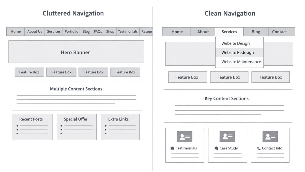
A lot of small business websites feel harder to use than they should be.
Visitors land on a page and start looking for direction. They scroll, click around, and try to piece things together. If it takes too long to understand what’s going on, they leave.
This usually comes down to structure and user experience.
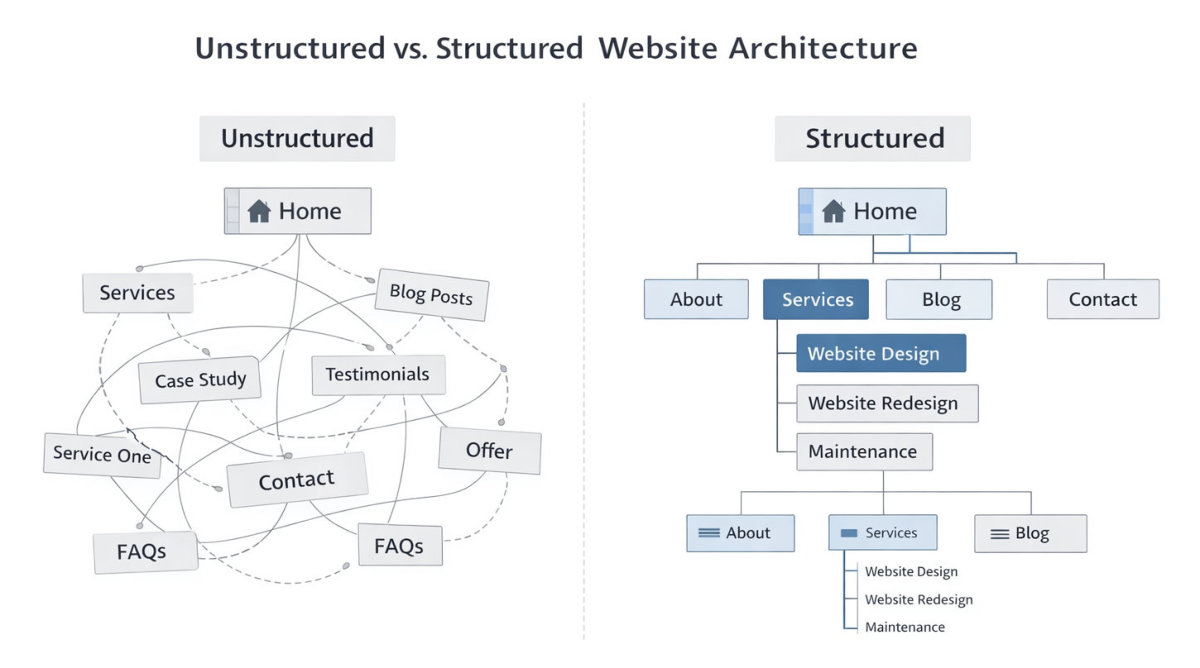
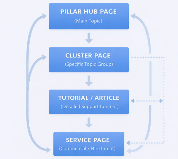
Structure is how your website is organised – your pages, navigation, and how everything connects. User experience is what someone goes through as they move through that structure. When both are clear and intentional, your website feels easy to use. People can quickly understand what you offer, where to go next, and how to take action.
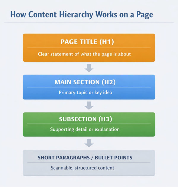
This page breaks down the key elements that shape that experience. It covers how your pages are set up, how navigation should work, how content is organised within each page, and how everything connects as a whole.
If your website feels scattered, overwhelming, or harder to navigate than it should be, this is often where the problem sits. Once the structure is clear, everything else becomes easier to build and refine.


