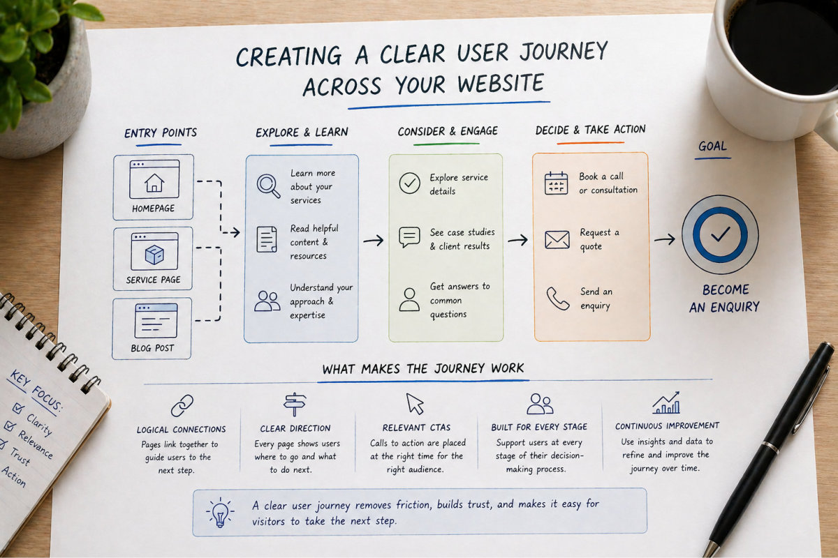
Getting someone to your website is only part of the process. What happens next determines whether that visit turns into an enquiry or disappears without action.

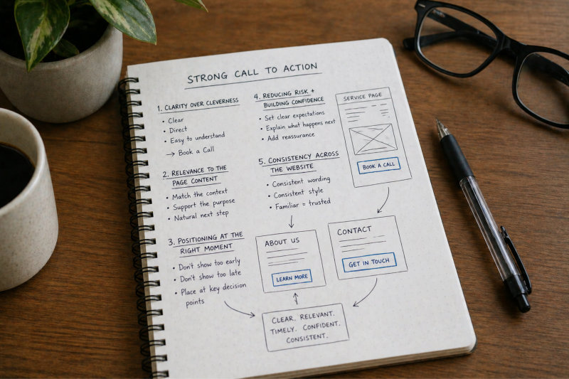
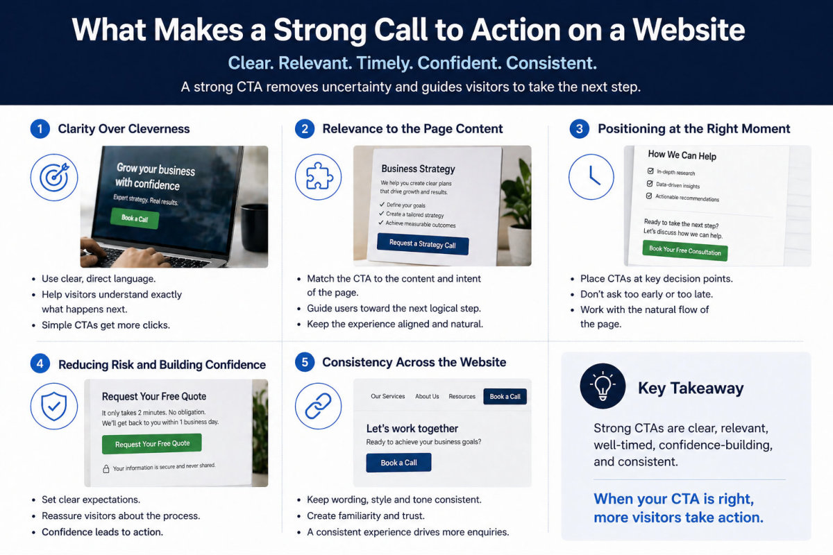
This is where calls to action and conversion strategy come in. Without clear direction, most visitors will browse, hesitate, and leave without taking the next step. Not because they are not interested, but because the path forward is unclear.

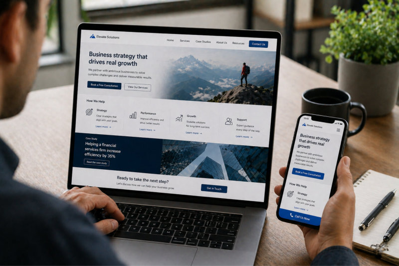
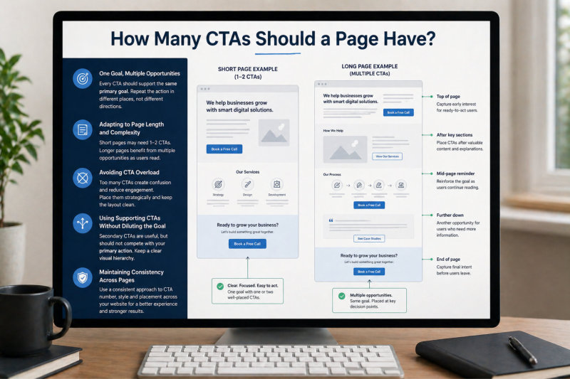
A strong website does not leave this to chance. It guides users through a clear journey, showing them what to do, when to do it, and why it matters.

This guide forms part of our complete resource on Website Conversion & Growth: Website Conversion & Growth.

You’ll learn what makes a call to action effective, where to place it for maximum impact, and how to structure your website so visitors are naturally guided toward becoming enquiries.

If your website is getting traffic but not converting, this is often the missing piece.

Calls to Action

What Makes a Strong Call to Action on a Website

What makes a strong call to action

Clarity Over Cleverness

A strong call to action is clear, direct, and easy to understand.

Visitors should not have to interpret what a button or link means or guess what will happen when they click it. If there is any hesitation or confusion, the likelihood of action drops immediately.

Many websites try to be clever with wording, using vague or creative phrases that sound interesting but lack clarity.

While this might feel more unique, it often reduces effectiveness because users are unsure what they are committing to.

Simple, direct language performs better. Phrases such as “Book a Call”, “Request a Quote”, or “Get Started” clearly communicate the next step and remove uncertainty.

When your call to action is obvious and easy to understand, users can make quick decisions without overthinking the process.

Relevance to the Page Content

A call to action should always match the context of the page it appears on. If the CTA feels disconnected from the content, it creates confusion and reduces trust.

For example, a service page explaining a specific offering should guide users toward enquiring about that service. A generic or unrelated CTA weakens the connection and makes the transition feel forced.

Each page should have a clear purpose, and the CTA should support that purpose. This alignment helps create a natural progression from reading to taking action.

When CTAs are relevant and contextual, they feel like the next logical step rather than an interruption.

Positioning at the Right Moment

The timing of a call to action is just as important as the wording. Presenting a CTA too early, before the user understands your offer, can feel premature. Placing it too late means you risk losing their attention before they act.

Strong CTAs appear at key decision points. This might be after explaining a service, outlining benefits, or answering common questions. These are moments where the user has enough information to consider taking the next step.

Well-placed CTAs work with the natural flow of the page rather than disrupting it.

If placement is not considered carefully, even a well-written CTA can underperform.

Reducing Risk and Building Confidence

Taking action on a website often involves some level of uncertainty. Visitors may be unsure about the process, the outcome, or whether they are making the right decision.

A strong call to action helps reduce this perceived risk by setting clear expectations. This might include indicating what happens next, how long it will take, or what the user can expect after clicking.

Supporting text around the CTA can also reinforce confidence. Simple reassurance can make a significant difference in whether someone follows through.

When users feel confident and informed, they are far more likely to take action.

Consistency Across the Website

Your calls to action should be consistent across your website in both wording and style. When CTAs vary too much, it creates confusion and weakens the overall user experience.

Consistency helps reinforce your messaging and makes it easier for users to recognise the next step. It also creates a sense of structure and professionalism across your pages.

This does not mean every CTA must be identical, but they should follow a clear pattern in tone, intent, and design.

When users become familiar with how your CTAs work, they are more likely to engage with them throughout your website.

If your website is not generating consistent enquiries, reviewing how your calls to action are written and positioned is often one of the most effective places to start. Why You Must Include Powerful Calls to Action On Your Website explores this in more detail.

What makes a strong call to action

Where to Place CTAs for Maximum Impact

Above the Fold Without Being Premature

The area above the fold is one of the most valuable positions on your website, but it is often misunderstood. While it makes sense to include a call to action here, it should not feel rushed or out of place.

Visitors landing on your website need a moment to understand what you do before being asked to take action. If a CTA appears without enough context, it can feel premature and may be ignored.

The most effective approach is to combine a clear headline, a short supporting message, and a well-placed CTA that feels like a natural next step rather than a demand.

When done properly, above-the-fold CTAs capture users who are ready to act quickly while still supporting those who need more information.

After Key Sections That Build Understanding

Strong calls to action are often placed after sections that explain your services, highlight benefits, or answer important questions. These are moments where users have gained enough clarity to consider taking the next step.

Placing a CTA immediately after these sections allows users to act while the information is still fresh and relevant. It removes the need for them to search for how to contact you.

This approach aligns the CTA with user intent. Instead of interrupting the experience, it supports the natural flow of the page.

When CTAs are placed at these decision points, they feel helpful rather than pushy.

At the End of Pages to Capture Final Intent

Many users scroll through an entire page before deciding whether to take action. If there is no clear CTA at the end, this opportunity is often lost.

An end-of-page CTA captures users who have taken the time to read and are now ready to move forward. At this point, they have the highest level of context and understanding.

This CTA should be clear, confident, and directly related to the content they have just consumed.

Without this final step, users may leave with interest but no clear way to act on it.

It also acts as a natural conclusion to the page. After guiding users through your message, answering their questions, and building trust, the final CTA gives them a clear next step without forcing them to scroll back up or search for how to proceed.

For best results, this section should feel intentional rather than an afterthought. A strong closing message, paired with a well-designed CTA, reinforces the value of your offer and makes it easy for users to act while their interest is at its peak.

Where to place CTAs

Repeated Strategically Across Longer Pages

On longer pages, relying on a single call to action is rarely effective. Users may not scroll to the bottom, and their decision points can occur at different stages.

Including multiple CTAs throughout the page ensures that users have access to an action point whenever they are ready. This is particularly important for service pages and detailed content.

However, repetition should be strategic rather than excessive. Each CTA should appear in a logical place where it supports the content.

When used correctly, repeated CTAs increase visibility without overwhelming the user.

Supporting Different User Behaviours

Not all users interact with your website in the same way. Some will skim quickly and look for immediate action, while others will read in detail before making a decision.

Your CTA placement should cater to both behaviours. This means including visible options for quick action as well as well-positioned CTAs for users who engage more deeply with your content.

By designing for different user journeys, you increase the likelihood of capturing enquiries across a wider audience.

This is where overall page structure becomes critical. If your content does not guide users properly, even well-placed CTAs will struggle to perform. The Lead Generation & Enquiries section explains how structure and enquiry pathways work together.

How Many CTAs Should a Page Have

One Goal, Multiple Opportunities

Every page on your website should have one clear primary goal. This does not mean you should only include one call to action, but it does mean every CTA should support the same outcome.

Many websites make the mistake of trying to achieve too many things at once. Multiple competing CTAs create confusion and make it harder for users to decide what to do next.

A more effective approach is to repeat the same core action in different places throughout the page. This reinforces the intended outcome and makes it easier for users to take that step when they are ready.

When all CTAs point toward the same goal, the page feels focused and purposeful rather than scattered.

Adapting to Page Length and Complexity

The number of CTAs on a page should reflect the length and depth of the content. Short pages may only require one or two well-placed CTAs, while longer pages benefit from multiple opportunities for action.

As users move through longer content, their readiness to act can change. Some may decide early, while others need more time and information before taking the next step.

Including CTAs at different points ensures that you are not relying on a single moment to capture interest.

This approach supports different user behaviours and increases the likelihood of conversion across a wider audience.

Avoiding CTA Overload

While multiple CTAs can be effective, too many can have the opposite effect. When users are presented with too many buttons or options, it can create decision fatigue and reduce overall engagement.

CTA overload often happens when every section includes a different action or when visual design makes all CTAs compete for attention at the same time.

Instead of adding more CTAs, focus on placing them strategically and ensuring they are clearly connected to the content around them.

A clean and structured layout helps users stay focused and makes each call to action more impactful.

It is also important to prioritise one primary action. When every button is styled the same and given equal visual weight, users struggle to identify what matters most. This lack of hierarchy makes the page feel cluttered and directionless, even if the content itself is strong.

By reducing visual noise and reinforcing a clear priority, your CTAs become easier to recognise and act on. Fewer, better-placed calls to action will almost always outperform a page filled with competing options that dilute focus.

How many CTAs should be on a page

Using Supporting CTAs Without Diluting the Goal

In some cases, it makes sense to include secondary calls to action alongside your primary goal. These might include options such as reading more content, downloading a resource, or exploring related services.

However, these supporting CTAs should not compete with your main objective. They should act as alternative pathways for users who are not yet ready to take the primary action.

The key is to maintain a clear hierarchy. Your primary CTA should stand out, while secondary options remain visible but less dominant.

This balance allows you to capture a wider range of users without weakening your main conversion goal.

Maintaining Consistency Across Pages

The number and style of CTAs should feel consistent across your website. If one page is minimal and another is overloaded, it creates an uneven experience and can reduce trust.

Consistency helps users understand how your website works and what actions are expected. It also reinforces your overall conversion strategy.

This does not mean every page must be identical, but there should be a clear pattern in how CTAs are used and presented.

When your website follows a consistent approach, users are more likely to engage confidently with your calls to action.

If your pages feel inconsistent or unclear, it often points to a broader issue with user flow. The Continuous Website Improvement & Growth section explores how small adjustments can improve overall performance.

Soft vs Direct CTAs: When to Use Each

Understanding the Difference Between Soft and Direct CTAs

Calls to action generally fall into two categories: soft and direct. A direct CTA asks the user to take a clear, immediate action, such as “Book a Call” or “Request a Quote”. A soft CTA invites a lower-commitment step, such as “Learn More” or “View Services”.

Both types have a role, and neither is inherently better than the other. The effectiveness of each depends on where the user is in their decision-making process.

If you rely only on direct CTAs, you risk pushing users who are not yet ready. If you rely only on soft CTAs, you may never create enough urgency for users to take action.

A balanced approach allows you to guide users progressively rather than forcing them into a single decision point.

When to Use Direct CTAs

Direct CTAs work best when users have enough information and confidence to take the next step. This typically happens after they have explored your services, understood your offering, and feel aligned with your approach.

At this stage, the goal is to make the action clear and easy. Strong, confident language helps remove hesitation and encourages users to move forward.

Direct CTAs are particularly effective on service pages, pricing pages, and sections where the value has already been established.

When used at the right moment, they help convert interest into action without unnecessary delay.

When to Use Soft CTAs

Soft CTAs are useful earlier in the user journey, when visitors are still exploring and building understanding. At this stage, asking for a high-commitment action can feel premature.

Instead, soft CTAs guide users deeper into your website, encouraging them to learn more, explore services, or read additional content.

This helps build trust and familiarity before introducing a stronger call to action later.

Soft CTAs are especially important for users who need more context before making a decision.

They also reduce pressure. Not every visitor arrives ready to commit, and pushing too hard too early can create resistance. A softer approach keeps users engaged without forcing a decision, allowing them to move at their own pace.

When used strategically, soft CTAs act as stepping stones. They move users forward gradually, increasing their understanding and confidence until they are ready to take a more direct action.

Combining Both for a Stronger Conversion Path

The most effective websites use a combination of soft and direct CTAs to create a natural progression. Users are first guided through softer actions, and then presented with direct options once they are ready.

This approach respects different user behaviours and avoids forcing decisions too early.

For example, a homepage might use soft CTAs to guide users to service pages, while those pages then introduce direct CTAs to generate enquiries.

By layering your CTAs in this way, you create a smoother and more effective conversion journey.

Avoiding Mixed Signals and Confusion

One of the most common mistakes is mixing too many different types of CTAs without a clear hierarchy. When users are presented with conflicting actions at the same time, it creates confusion and reduces the likelihood of any action being taken.

Your CTAs should guide users, not compete for attention. This means being intentional about which action you prioritise at each stage of the page.

Clear structure and consistent messaging help ensure that users always understand what to do next.

If your website feels scattered or unclear, it is often a sign that your CTAs are not aligned with your overall user journey. The Landing Pages & Sales Pages section explores how focused pages use this balance to improve conversions.

Why Most Websites Fail to Guide Users Properly

Lack of Clear Direction

One of the biggest reasons websites fail to convert is that they do not clearly guide users toward a next step. Visitors arrive, browse a few sections, and then leave because there is no obvious direction on what to do next.

This is rarely intentional. Most business owners assume that users will naturally figure it out. In reality, if the path is not clearly defined, most people will not take action.

A website needs to act as a guide, not just a source of information. Every page should lead somewhere, and every section should support a clear progression.

Without direction, even strong content and design will struggle to generate enquiries.

Too Many Competing Messages

Many websites try to communicate too much at once. Multiple services, mixed messages, and competing priorities create confusion rather than clarity.

When users are presented with too many options or unclear positioning, it becomes difficult to decide what to focus on. This often leads to inaction.

Instead of trying to say everything, effective websites prioritise what matters most. They guide users toward a specific outcome rather than overwhelming them with choices.

Clear, focused messaging makes it easier for users to understand and act.

Poor Connection Between Content and Action

A common issue is the disconnect between what a page explains and what it asks the user to do next. Content may be informative, but if it does not lead naturally into a call to action, the opportunity is lost.

For example, a detailed service page without a clear enquiry option leaves users unsure of how to proceed. The content builds interest, but the next step is missing or unclear.

Strong websites create a clear link between content and action. Each section builds toward a logical next step, making it easy for users to move forward.

This connection is what turns interest into enquiries.

The problem often comes down to missed transitions. Users finish reading a section and are left with no direction, which breaks momentum. Even small gaps like this can cause drop-off, because users are forced to decide what to do instead of being guided.

When content and action are aligned, the experience feels seamless. Users move from understanding to decision without friction, because the next step is obvious and easy to take.

Where most websites fail

Ignoring Different User Behaviours

Not all visitors interact with your website in the same way. Some are ready to act quickly, while others need more time to explore and build confidence.

Websites that fail to account for this often lose opportunities. If the only option is a direct enquiry, users who are not ready will leave. If there is no clear path for ready users, they may not take action either.

A well-structured website supports both behaviours. It provides quick access to action while also offering deeper content for those who need it.

This flexibility is essential for capturing a wider range of enquiries.

No Clear User Journey Across Pages

Many websites are built as a collection of pages rather than a connected experience. Users move from one page to another without a clear sense of progression or purpose.

This lack of cohesion makes it harder for visitors to understand how everything fits together. As a result, they may leave before reaching a decision point.

A strong website creates a clear journey across pages, guiding users from initial interest to enquiry. This involves linking content logically, reinforcing key messages, and placing calls to action at the right moments.

If your website feels disconnected or inconsistent, it often reflects a deeper structural issue. The Lead Generation & Enquiries section explains how structure and enquiry pathways work together to improve results.

Creating a Clear User Journey Across Your Website

Understanding How Users Actually Move Through Your Website

A clear user journey starts with understanding how visitors interact with your website in reality, not how you expect them to. Most users do not follow a perfect path. They land on different pages, skim content, jump between sections, and make decisions at different points.

This means your website cannot rely on a single linear flow. Instead, it needs to support multiple entry points and still guide users toward the same outcome.

Each page should work independently while also connecting logically to other parts of the site. Whether someone lands on your homepage, a service page, or a blog post, the path forward should be clear.

When your website is structured around real user behaviour, it becomes much easier to guide visitors toward enquiries.

Connecting Pages to Create a Logical Flow

A strong user journey is created by linking pages together in a way that makes sense. Users should not feel like they are navigating a collection of unrelated pages, but rather moving through a connected experience.

This involves guiding visitors from one page to the next based on their level of interest and understanding. For example, a homepage might lead to service pages, which then guide users toward making an enquiry.

Internal linking plays a key role in this. It helps users explore relevant content without needing to search for it themselves.

When pages are connected logically, users are more likely to stay engaged and move closer to taking action.

Aligning Content, CTAs and Enquiry Points

Your content, calls to action, and enquiry options all need to work together as part of the same system. If these elements are disconnected, the user journey breaks down.

Content should build understanding and trust, CTAs should guide users toward the next step, and enquiry points should make it easy to take action. When one of these elements is missing or misaligned, the process becomes less effective.

For example, strong content without a clear CTA leaves users unsure of what to do next. A well-placed CTA without supporting content feels premature.

Alignment ensures that each part of the page supports the overall goal of generating enquiries.

Designing for Different Stages of Decision-Making

Visitors arrive at your website at different stages of readiness. Some are exploring options, others are comparing providers, and some are ready to take action immediately.

Your website should cater to all of these stages. This means providing content for those who need more information, as well as clear pathways for those who are ready to enquire.

Soft CTAs can guide early-stage users deeper into your content, while direct CTAs capture those who are ready to act.

By supporting different stages of decision-making, you create a more flexible and effective user journey.

Continuously Improving the User Journey Over Time

A user journey is not something you set once and leave unchanged. As your business evolves and you gain more insight into how users behave, your website should adapt accordingly.

This might involve adjusting CTA placement, refining content, or improving how pages are connected. Even small changes can have a noticeable impact on how users move through your site.

Monitoring performance and making incremental improvements helps ensure your website continues to support your goals.

If you want to refine how your website performs over time, the Continuous Website Improvement & Growth section outlines practical ways to do this without starting from scratch.

Creating a clear user journey

Frequently Asked Questions

A call to action (CTA) is any prompt that encourages a visitor to take the next step on your website. This could include actions such as contacting you, booking a call, requesting a quote, or exploring more content. A strong CTA clearly tells the user what to do next and removes any uncertainty around the process.

Calls to action are essential because they guide users toward taking action. Without them, visitors may browse your website but leave without engaging further. Even if someone is interested in your services, a lack of clear direction can prevent them from becoming an enquiry. CTAs bridge the gap between interest and action.

Calls to action should be placed at key decision points throughout your website. This includes above the fold, after important sections of content, and at the end of pages. They should also be visible across your site, including in navigation or key areas where users are likely to look for next steps. Placement should align with user intent rather than being random.

A page should have one primary goal, but multiple opportunities for users to take that action. Longer pages typically require more CTAs placed at different points to match user behaviour. The key is to avoid overwhelming users with too many competing options while still making the primary action easy to access.

Soft CTAs encourage users to take a lower-commitment step, such as learning more or exploring services. Direct CTAs ask for a clear action, such as booking a call or requesting a quote. Both are important and should be used strategically depending on where the user is in their decision-making process.

If your CTAs are not performing, it is often due to unclear wording, poor placement, or lack of supporting content. Users may not understand what the action involves, may not feel ready to take the next step, or may not even notice the CTA. Reviewing clarity, positioning, and overall page structure can help identify the issue.

Improving conversion rates usually involves refining your messaging, improving CTA placement, simplifying the enquiry process, and ensuring your website guides users clearly. Small changes such as rewriting CTAs, repositioning them, or reducing friction in forms can have a significant impact without requiring a full redesign.

CTAs primarily impact conversions, but they also indirectly support SEO. When users engage more with your website, spend more time on pages, and navigate through your content, it sends positive signals to search engines. A well-structured site with clear user flow supports both visibility and performance.

Guiding Visitors Toward Action with Clarity and Purpose

Calls to action are not just buttons on a page. They are a core part of how your website communicates, guides, and converts visitors into enquiries.

When your CTAs are clear, well-placed, and aligned with your content, they create a natural path for users to follow. Instead of leaving visitors to figure things out, your website actively supports their decision-making process.

Many websites underperform because they lack this structure. The messaging may be strong and the design may look good, but without clear direction, users hesitate and opportunities are lost.

By focusing on clarity, consistency, and user flow, you create a website that feels intuitive and easy to navigate. This not only improves conversions but also strengthens the overall experience for your audience.

If you are ready to build or refine a website that guides visitors effectively and supports real business growth, you can explore our website design services.

You can also explore practical strategies and step-by-step resources here: Guides.

When your website is structured to guide users properly, conversions become a natural outcome rather than something you have to chase.

Ready to Build or Redesign Your Website?

If you’re reading this and thinking, “This explains exactly what’s wrong with my site,” you’re not alone.

Most small business websites don’t fail because of effort. They fail because they were built without a clear structure, proper planning or long-term thinking.

If you want a website that reflects your business properly, feels organised, and gives you confidence to send people to it, then it might be time for a proper redesign or rebuild.

You can see how I approach website projects here:

Website Design Services for Small Business

View recent website design projects

Whether you’re starting from scratch or improving what you already have, the goal is the same – clarity, structure and a site you’re proud to share.

Ivana Katz - Website designer