Common Website Mistakes Northern Beaches Businesses Make (and How to Avoid Them)
Most small business websites are not failing because the business itself is the problem. In many cases, the issue comes down to how the website is structured, what it communicates, and how easy it is for someone to take the next step.
It is surprisingly common to see websites that look good on the surface but do not actually guide the visitor. They might have nice images, clean layouts, and all the expected pages, yet they still do not generate enquiries or support the business properly.
These problems are not always obvious, especially when you are looking at your own website. You know your business, so it is easy to fill in the gaps without realising that a potential client does not have that same context.
Over time, certain patterns show up again and again. The same mistakes appear across different industries, from local service businesses through to consultants and established companies. Once you know what to look for, they become much easier to fix. This is something I see regularly with Northern Beaches businesses, regardless of industry or size.
Looks Good But Says Nothing
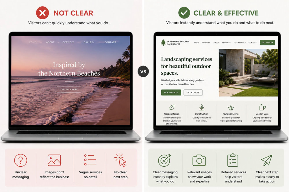
One of the most common issues is a website that looks polished but does not clearly explain what the business actually does. The design might be modern and visually appealing, but when someone lands on the page, they are left trying to work out what is being offered and whether it is relevant to them.
This usually happens when the focus is placed on appearance rather than communication. Business owners often want their site to look professional, which is important, but if the message is not clear, the design cannot compensate for that.
I recently looked at a local service website where the design was clean, but nowhere on the home page did it clearly say what the business actually did. It looked professional, but you had to dig through multiple sections just to understand the service.
When a visitor cannot quickly understand what you do, they will not spend time trying to figure it out. They will simply leave and look elsewhere. Clarity always matters more than visual polish when it comes to getting enquiries.
The fix is to make your messaging direct and specific. Your home page and key sections should clearly state what you do, who you help, and how someone can get started. When that is in place, the design can then support the message rather than replace it.
Images That Don’t Reflect Your Business
Another common issue is using images that have little or no connection to the actual business. This often happens when business owners try to make their website feel more “local” by adding beach photos or scenic shots, simply because they are based on the Northern Beaches.
While the intention makes sense, the result can be confusing. If someone lands on a website and sees large beach images, they may assume the business is related to travel, lifestyle, or tourism. If the business is actually an accountant, consultant, or service provider, there is a disconnect that makes it harder to understand what is being offered.
Your images should support your message, not distract from it. They should reflect your services, your work, or the type of clients you help. When the visuals and the message are aligned, it becomes much easier for someone to quickly understand what you do and feel confident they are in the right place.
This does not mean you cannot include a sense of location, but it should be done in a way that supports your business rather than becoming the focus. A subtle reference to your area is very different from building your entire visual identity around it.
In practice, this means choosing images that reinforce your services, show real examples of your work, or create a clear and professional impression. When your visuals match your message, your website feels more credible and far easier to understand.
A Weak or Confusing Services Page
The services page is often where people decide whether to take the next step, yet it is one of the most commonly underdeveloped parts of a website. Many service pages are either too vague or too brief, which makes it difficult for potential clients to understand what is actually being offered.
This usually comes from trying to keep things simple or not wanting to overwhelm visitors with too much detail. The result is the opposite. Without enough information, people are left with questions, and uncertainty often leads to inaction.
This is something I see often with tradie and consulting websites, where everything is grouped under one general services page. Instead of clearly explaining each service, it ends up being a short summary that leaves people with more questions than answers.
A strong services page should clearly outline what you offer, how it works, and what someone can expect. If you offer multiple services, breaking them into separate sections or pages can make a big difference. It allows you to explain each one properly instead of trying to fit everything into a single block of text.
If you are unsure how to structure this properly, this guide on what pages a website needs explains how your services page fits into the overall structure.
No Clear Next Step
Another common issue is a website that does not clearly tell the visitor what to do next. Someone might land on the site, read through the information, and feel interested, but if there is no obvious next step, they will often leave without taking action.
This happens when contact options are hidden, unclear, or simply not emphasised enough. Sometimes the contact page exists, but there is no strong reason or prompt encouraging someone to use it.
I have seen websites where the contact page exists, but there is no clear prompt to use it. Visitors reach the end of the page and simply leave because there is no strong reason or direction telling them what to do next.
People do not always take initiative when it comes to reaching out. Even if they are interested, they often need a clear and simple path to follow. Without that, the opportunity is lost.
The fix is to make the next step obvious and easy. Whether it is filling out a contact form, sending an enquiry, or booking a call, it should be visible throughout the site and clearly positioned at the right moments. Small changes here can have a significant impact on how many enquiries your website generates.

Website Designer Ivana Katz
If you’re ready to stop overthinking your website and just get it done properly, that’s where I can help.
I work with small business owners across Sydney’s Northern Beaches and beyond, creating websites that reflect your business clearly and give you something you feel confident sharing.
If you’d like to see how this could work for your business, you can explore the options and next steps on the website design Northern Beaches page.
Or if you prefer to talk it through, book a free website strategy call with me.
Poor Structure or Too Many Pages
Another common issue is a website that either has too little structure or far too much of it. In some cases, everything is squeezed into a few pages, which makes it difficult to explain services properly. In other cases, there are too many pages with no clear hierarchy, which makes navigation confusing.
For example, a website might say it offers a high-quality service, but without testimonials or examples, there is nothing to support that claim. Even a few short client quotes can make a significant difference here.
This often happens when a website grows without a clear plan. New pages get added over time, but they are not connected properly, and visitors are left trying to work out where to go next.
When the structure is unclear, it creates friction. People cannot easily find what they are looking for, and even if the information exists somewhere on the site, it may as well not be there if it is buried or difficult to access.
The solution is to simplify and organise your pages around how your clients think. Your main navigation should guide people through your site logically, with clear pathways from general information through to specific services and contact points. A smaller number of well-structured pages is far more effective than a large number of disconnected ones.
Slow Website Speed and Performance Issues
Another issue that often gets overlooked is website speed. A website might look good visually, but if it loads slowly or feels clunky to use, it can quickly frustrate visitors and reduce enquiries.
This is especially common on websites with oversized images, too many plugins, poor hosting, or pages that have gradually become bloated over time. In many cases, business owners are not even aware there is a problem because they are used to how the site behaves.
Visitors are far less patient. If a website takes too long to load, feels difficult to navigate, or performs poorly on mobile devices, many people will leave before they even read the content properly.
Website performance can also affect visibility in search results, as Google considers page experience and loading performance as part of the overall user experience. Tools like Google PageSpeed Insights can help identify speed and usability issues that may be affecting your site.
The fix is not always complicated. Compressing images, improving hosting, simplifying layouts, and removing unnecessary plugins can often make a significant difference. The goal is not just to make the website look good, but to make sure it feels smooth and easy to use for the people visiting it.
No Proof or Testimonials
Many websites rely entirely on what the business says about itself, but do not include enough evidence to support those claims. Without proof, visitors are left to decide whether to trust you based on your own description, which can create hesitation.
People naturally look for reassurance before making a decision. They want to know that others have worked with you and had a positive experience. Without testimonials, examples, or visible results, that reassurance is missing.
This does not mean you need a long list of reviews, but you do need some form of proof. Even a small number of well-presented testimonials can make a significant difference. Case studies, before and after examples, or portfolio work can also help reinforce your credibility.
If you want to see how this looks in practice, you can explore examples in this Northern Beaches website design portfolio, where real businesses are showcased.
Built Around the Business, Not the Client
A subtle but important mistake is building a website around what the business wants to say rather than what the client needs to understand. This often shows up in content that is too focused on the business itself, its background, or its internal language.
While it is natural to want to talk about your experience and what you do, visitors are usually thinking about their own situation. They want to know how you can help them, what problem you solve, and what the outcome will be.
When a website is too inward-focused, it creates a disconnect. Visitors have to translate the information themselves instead of being guided clearly. This increases the effort required to understand your offering, and many people will simply move on rather than work it out.
The fix is to shift your messaging towards the client. Your pages should reflect their questions, their concerns, and the outcomes they are looking for. When someone feels understood, they are far more likely to take the next step.
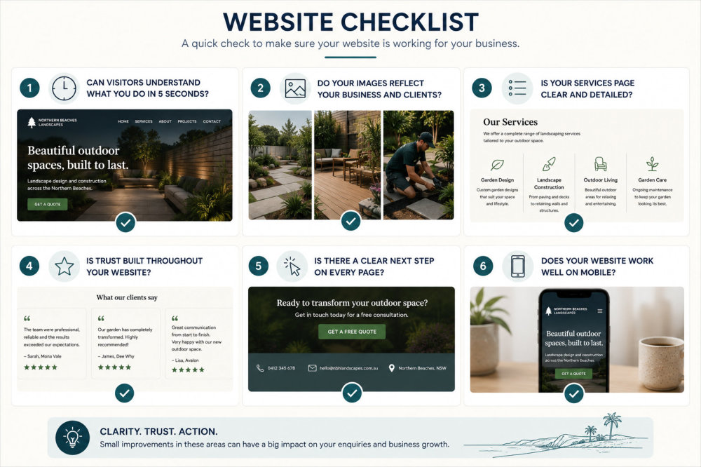
Quick Website Check
Ask yourself:
- Is it clear what I do within 5 seconds?
- Can someone easily find my services?
- Is there a clear next step on every page?
- Do I show proof that I’ve helped others?
A DIY Website That Never Got Finished
If your website is not bringing in enquiries, there is usually a clear reason for it.
Many websites start as a DIY project with good intentions but are never fully completed. Pages remain half-written, sections are missing, or the overall structure is not properly finalised. From the outside, the website may look functional, but it does not perform as it should.
This usually happens because building a website involves more than just setting up pages. It requires decisions about structure, content, layout, and how everything connects. Without a clear process, it is easy to get stuck or lose momentum.
An unfinished website can be just as limiting as not having one at all. It may not clearly represent your business, and it can reduce confidence for potential clients who are trying to decide whether to contact you.
If you are considering whether to continue building it yourself or get support, this comparison of DIY vs professional website design explains what tends to work best in practice.
Want a Website You Feel Confident Sharing?
If your website looks fine on the surface but still is not bringing in enquiries, there is usually a clear reason why. Sometimes it comes down to structure, messaging, or simply making it easier for people to understand what you do and take the next step.
If you’re based on Sydney’s Northern Beaches and want a website that feels clearer, more professional, and easier to share with confidence, explore our Northern Beaches website design services or book a quick strategy call to talk through what might be holding your current website back.”
Frequently Asked Questions
What are the most common website mistakes small businesses make?
Some of the most common mistakes include unclear messaging, weak services pages, no clear next step, and a lack of testimonials or proof. Many websites also struggle with poor structure, where important information is either missing or difficult to find. These issues often prevent visitors from taking action, even if the business itself is strong.
Why does my website look good but not get enquiries?
This usually comes down to clarity rather than design. A website can look polished, but if it does not clearly explain what you do, who you help, and how someone can get started, visitors will leave without taking action. Design supports your message, but it cannot replace it.
How do I know if my services page is the problem?
If people regularly ask you questions that should already be answered on your website, your services page may not be clear enough. A strong services page should explain what you offer, how it works, and what someone can expect. If that information is missing or too vague, it can reduce enquiries.
Do I need testimonials on my website?
Yes, in most cases. Testimonials provide reassurance that others have worked with you and had a positive experience. Without them, visitors are relying only on what you say about yourself, which can create hesitation. Even a small number of genuine testimonials can make a noticeable difference.
Can I fix my website without rebuilding it completely?
In many cases, yes. If the main issue is structure or messaging, improving your existing pages can make a significant difference. However, if the site has multiple issues or has grown without a clear plan, a rebuild may be the more effective option in the long term.
Is it better to build my own website or hire someone?
It depends on your time, confidence, and how important the website is to your business. Building your own site can work, but it often takes longer than expected and can lead to gaps in structure or messaging. Working with a professional provides guidance and helps avoid common mistakes, which can make the process more efficient.
How do I know if my website is holding my business back?
If your website is not generating enquiries, does not clearly explain what you do, or leaves people confused about the next step, it may be limiting your business. A strong website should support your growth, not create friction or uncertainty for potential clients.